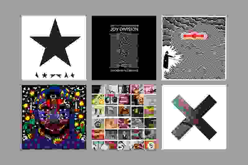
World Music Day: our favourite album artwork
Alex Steinweiss of Columbia Records was the man credited with inventing the concept of album covers and cover art in 1939. Since then, we have watched music and design move together through music videos, live shows and various other promotions, but none has generated such passion as that which people reserve for album covers and cover art. In an interview with Design Week, Angus Hyland, a partner at design firm Pentagram stated: “Record sleeves are the reason I ended up doing graphic design”. After all, designing for music can have a great and lasting impact; just like everyone associates Nirvana with the naked baby on their Nevermind cover, everyone associates Bruce Springsteen with the American flag of Born in the U.S.A. Often, album covers and cover art act as a keyhole into the music, a 5x5 snapshot of what is to come, or become a visual representation of the musician. In celebration of World Music Day, we thought we’d take a look at some of our favourites (as picked by the designers!).
Lucy's pick - Joy Division – Unknown Pleasures (1979), by Joy Division, Peter Saville and Chris Mathan

Adorning t-shirts for the last 30+ years as well as many people's skin, the symbol of Unknown Pleasures has become synonymous with Joy Division. Surprisingly though, it actually comes from a figure in The Cambridge Encyclopaedia of Astronomy and is the marking of the world’s first pulsar – a neutron star that emits beams of radiation and sweeps through the earth’s line of sight. It was first done by Harold D. Craft, Jr. in the 1971 American Scientific Journal.
Danielle's pick - Thom Yorke - Eraser (2006), by Stanley Donwood
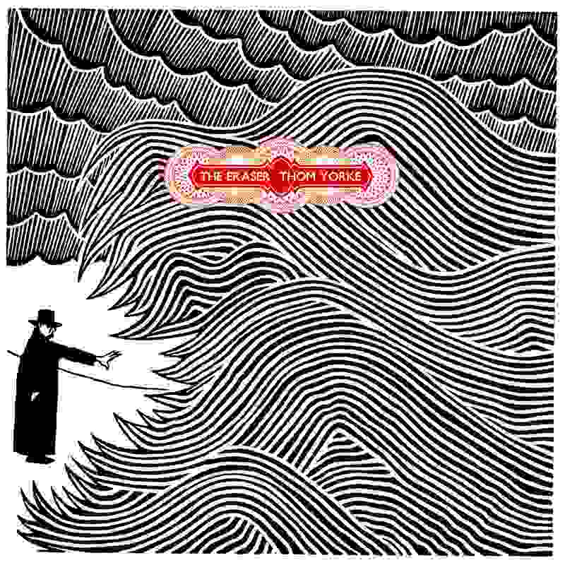
Longtime Radiohead cover artist, Donwood, went on to do the design for Thom Yorke's debut album, The Eraser. It is said to have been inspired by the legend of King Canute failing to command the ocean, which Yorke likened to the Government's attitude towards climate change. Donwood developed it on linoleum, having to therefore do it backwards which took several months. Recent work includes the artwork for Glastonbury 2016.
Hannah's pick - The xx – Coexist (2012), by Davy Evans

For this album, Evans used DIY methods to create abstract imagery and textures that could be manipulated on screen. He would mix up chemicals and products before using microphotography to photograph and film the reactions. It has since been expanded to The xx’s live shows and music videos, which provides a fascinating visual experience to go alongside the music. Read his interview in full at It's Nice That.
Adrian's pick - Kaytranada – 99.9% (2016), by Ricardo Cavolo
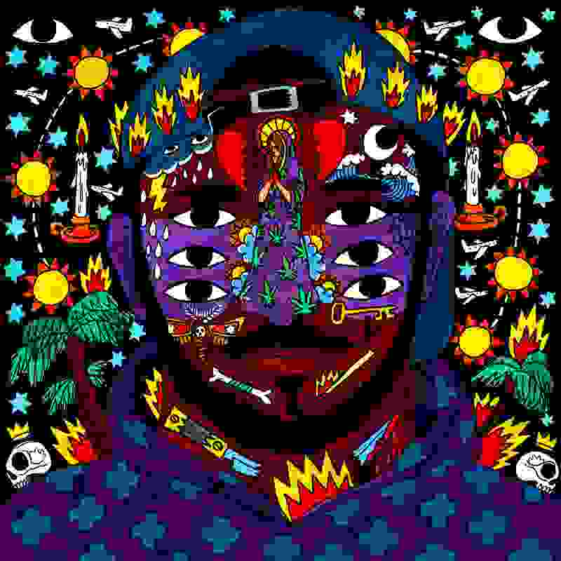
The cover for this debut album by Canadian electronic music producer has gained a great deal of attention. Cavolo is from Salamanca, Spain, but had done work in Montreal a few times, which meant Kaytranada saw some of his work and got in touch. Speaking with Amadeus Magazine, he tells how his influences come from outsider art, showing something “in a naif way”. The themes of his work are often about the B-side of life, non-standard people and marginal stories.
Marie's pick - David Bowie – Blackstar (2016), by Jonathan Barnbrook
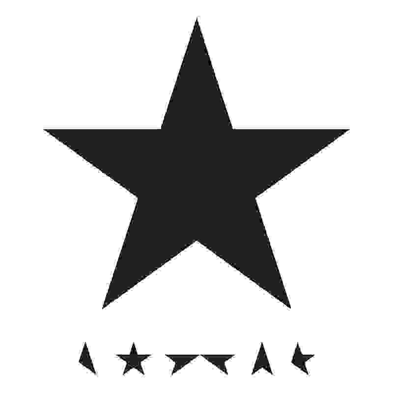
Jonathan Barnbrook has been the designer of all of Bowie’s album covers from 2002 till his death. Talking to Creative Review about what would be Bowie’s last album, Barnbrook spoke of how the star came from speaking to Bowie about ways to represent the album. He said though he previously only used his conversation with William Burroughs as something to mention when namedropping, it came to use during this album. Barnbrook stated, “I asked him about the future of typography and he said that letterforms would go back to hieroglyphs similar to the ancient Egyptians.” It was a way of being minimal, making it stand out, and using a recognised Unicode character.
Andy's pick - Pearl Jam – No Code (1996), by Jerome Turner (Eddie Vedder)