Defying conventional regulations
We hear it all the time: something is trending, people are really into this style. Different kinds of styles and trends will come and go as creatives. Culture, generations, new technology, and new slang—these have design trends popping up. We love seeing growing trends, and even more, we love to incorporate them into our work. As we've been discussing trends, there is one powerful one that comes up We want to show you our take on chaotic maximalism.
A brief history of chaotic maximalism
Chaotic maximalism really started within the postmodern movement; that spelled the end of the ultra-minimalist trends.
Creatives started bringing elements from different styles, eras, and cultures all into one—what emerged was a design that breaks all of the conventional regulations. One might say, even chaotic!
Defining chaotic maximalism
In brief, chaotic maximalism enjoys a diversity of colours, patterns, and imagery. In such a way, it creates a dynamism and look of energy that takes its lessons from older graphic movements.
Almost immediately, chaotic maximalism can be identified by the combining of many design elements together. This can be an illustration, typography, imagery, and mismatched colours. It pits itself against the mantra of minimalism: 'less is more'. It is over-the-top and fuses the various approaches to actually make a new style.
Looking for a partner for your next design project?
Get in touch
An eclectic mix of styles
Chaotic maximalism combines design influences from various eras, both historical and contemporary. Chaotic maximalism can also be seen to blend elements derived from Art Deco, Memphis design, psychedelic art, and pop culture, resulting in a collision of creative styles.
Vibrant colour schemes
Chaotic maximalism is all about bold and bright colours taking reigns in the design. The designs incorporate clashing colours and surprise combinations, which result in a sense of energy and visual tension that grabs the audience's attention.
Playful patterns
Patterns play a major role in chaotic maximalism. Patterns can be layered and put together to create visually appealing new art. Patterns include geometric shapes, florals and existing drawings to create new types of designs. Chaotic maximalism can almost be seen as one big collage. It combines diverse visual elements into one.
Attention to detail
Despite its chaotic nature, meticulous attention to detail is a crucial aspect of chaotic maximalism. Every element, irrespective of the size, is very much arranged to create a perfect visual balance within a design.
Want to learn more about our talented design team?
Meet the team
JUMP’s take on a chaotic maximalism
To put a tiny spark in the collective mind of our design team, something that tells them to go out and find more about chaotic maximalism, we briefed them to come up with a brand that exuded this aesthetic.
Taking inspiration from the wonderfully noisy celebration of National Candy Month, the project brief was based on a brand that is to be formed around either an already existing or completely fictional candy. Their task was simple: just embrace chaotic maximalism and let its colourful form come to life in their artwork. And here is the result of that creative explosion in their final concepts.
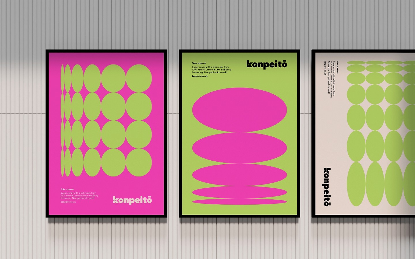
Konpeitō by Hannah
Hannah is a huge fan of Studio Ghibli, Spirited Away being one of her favourite childhood films. Typically, in a Hayao Miyazaki film, one will find some truly beautiful scenes with no dialogue or real 'plot', usually giving the impression of breathing space in the film—Hannah wanted to examine exactly how she could eschew this concept by utilising chaos and maximalism.
A chaotic colour palette to compliment a chaotic graphic design brief
So what was the logic for Hannah's colour palette? Well, as already mentioned, the colours chosen are going to display different flavours. Acid green shows lemon and lime, while fuchsia pink represents berries. Obviously, these colours are very bright, so to contrast these colours will be placed next to a sharp black, and an off-white colour will soften this scheme, as to not make it too chaotic!
Explore our branding services.
Learn more
Using a classic anime movie to create a unique name
Hannah's idea was inspired by the whimsical soot sprite characters in Spirited Away, who are fed a type of colourful sugar candy called Konpeitō ((kon-payee-toh)), brought to Japan by the Portuguese in the early 1500s. The word Konpeitō is derived from the Portuguese word confeito (confetti) which means candy or confection. These star-shaped candy treats are given to the sprites after an everlasting shift of labour at the bathhouse.
An inspiration behind the logo for Hannah, the shape of the star of konpeitō, was something she wanted to include within the logo, and the shape of the 'k' fits into that well.
Take a break. Now get back to work!
This was The tagline for Hannah's overall poster design had utilised the phrase 'take a break', borrowed for inspiration from this scene where Kamaji, the boss, offers soot sprites konpeitō during their break.
Hannah wanted to continue to elongate the star shape because, in addition to being inspired by konpeitō, it was inspired by soot sprites, so she extended it into multiple patterns that featured that shape in the negative space. A great way to exemplify chaotic maximalism!

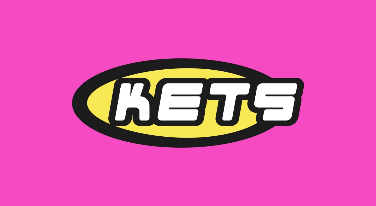
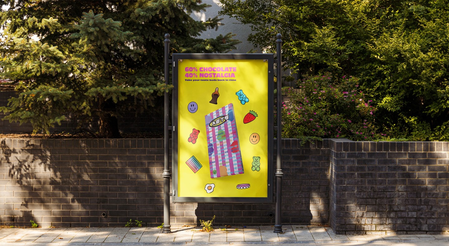
KETS by Alana
The next design is Alana's, where she designed it from her good memories of her childhood years. When she was creating her idea, its aim was to inspire nostalgia. To bring out that connotation, she incorporated what came to her mind when thinking of her childhood. The term 'kets' originated from a Northeast slang for sweets, which her grandparents and many other locals used and still use to this day. Selecting it gave her a known feeling about the brand, and also aligned well with the chaotic maximalism theme.
From classic childhood cartoons to a chaotic concept
Alana drew inspiration from beloved classic TV shows and cartoons such as Scooby-Doo, Kim Possible, Powerpuff Girls and Fairly Odd Parents. From there, she gathered colour palettes that represented the vibrant Y2K style, which worked well with the chaotic maximalism brief. Those shows shared really similar colour themes to her that spoke to being the perfect source of really capturing what it means to be nostalgic and playful. Using such animated colours in her concept, she attempts to elicit the same sense of happiness that these shows brought to her as a carefree child.
When designing the logo, Alana conducted research on old-school brand styles to capture the essence of the past. The font seemed very much like the wild, imaginative ones from the early 2000s, taking her back to her childhood.
See how we've helped brands stand out.
Capturing the essence of chaotic maximalism through graphic design
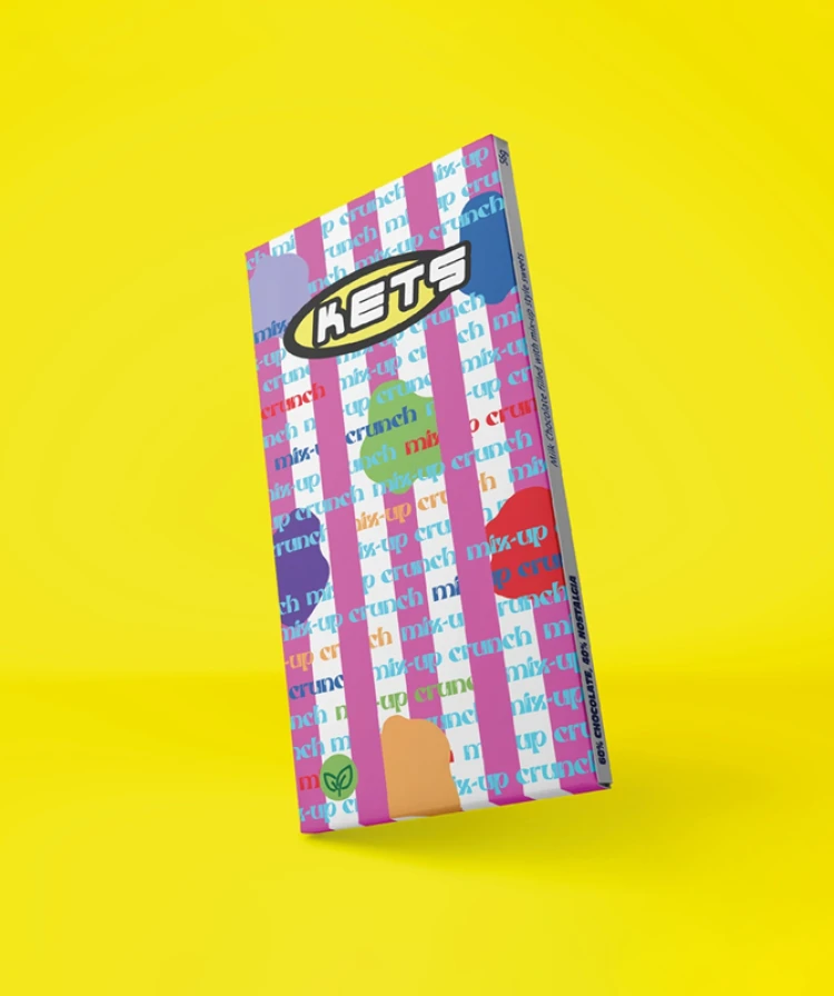
The chocolate bar is called 'mix-up crunch' as the term 'mix-up' was the slang term the childhood neighbourhood used for pick 'n' mix style sweets. The word 'crunch' is added to the name to include the sensation felt as you bite into the chocolate bar, which is packed with mixed-up style sweets.
For the packaging, she tried to emulate an old-fashioned feeling of sweet bags that you might, therefore, still see around now and again in amongst the blob shapes. Alana speaks about the addition of blob shapes into the design, honouring the fried egg soft sweets that are so frequently found in mix-ups, to add randomness and play into the chaotic maximalism design.
She was also playing with all these different fonts and layering to resonate with the brief and chaotic maximalism trend. Playful shapes and different fonts with variations in layering make to a visually dynamic and lively packaging design that is chaotic in its maximalism.
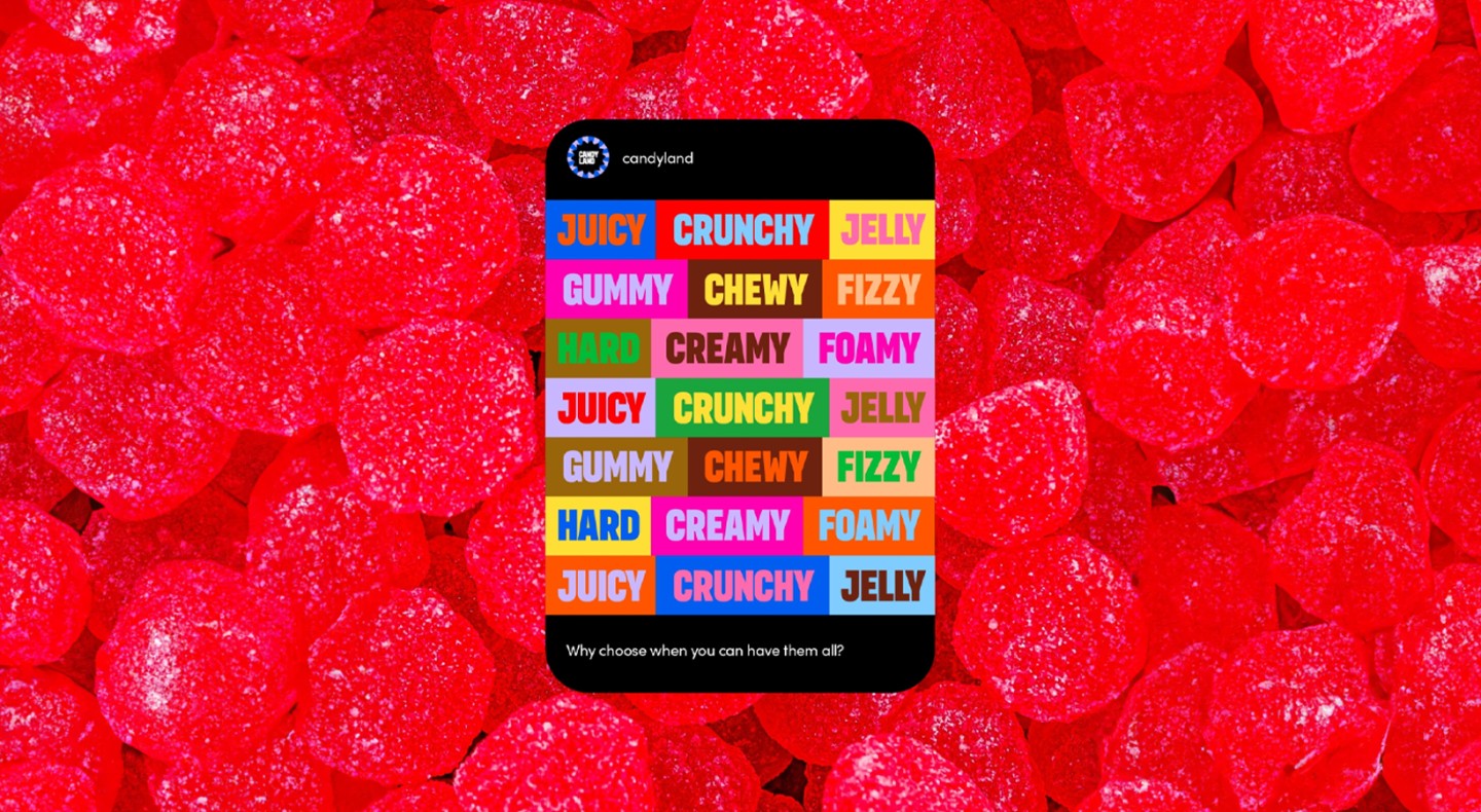
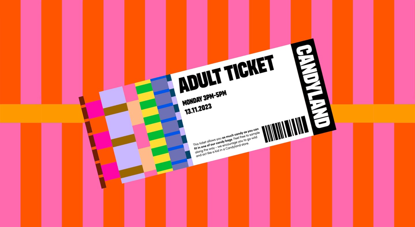
Candyland by Gemma
Here at the JUMP office, it’s no secret that Gemma is a candy-mad, colour addict - so a brief featuring candy and chaotic maximalism was a breeze for her.
During the research and conceptualisation phase, she found a lot of inspiration that made her feel young. In particular, she reminisced of the occasions when her grandmother would take her to the Food Weigh House in Chester-le-Street, affectionately referred to by her grandma as 'the bins shop'.
While her grandmother purchased nuts, flour, and other necessary ingredients from the large green bins, Gemma would make a beeline straight to the sweets section - or as she calls it - ‘heaven’.
Using chaotic maximalism to envision an idea of heaven
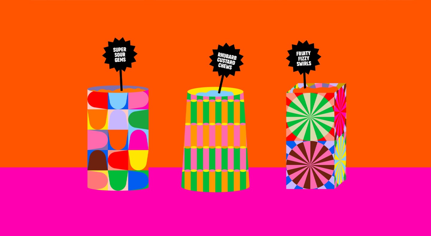
Drawing inspiration from those memories, Gemma developed a concept she called Candyland, which she envisioned as the ultimate romanticised version of a pick 'n' mix emporium. You were not going to pick out the sweets with small tongs in this imaginary world; you were going to use trowels and shovels instead. Huge barrels filled with an infinite variety of sweets, every type of sweet known to man. Chaotic maximalism!
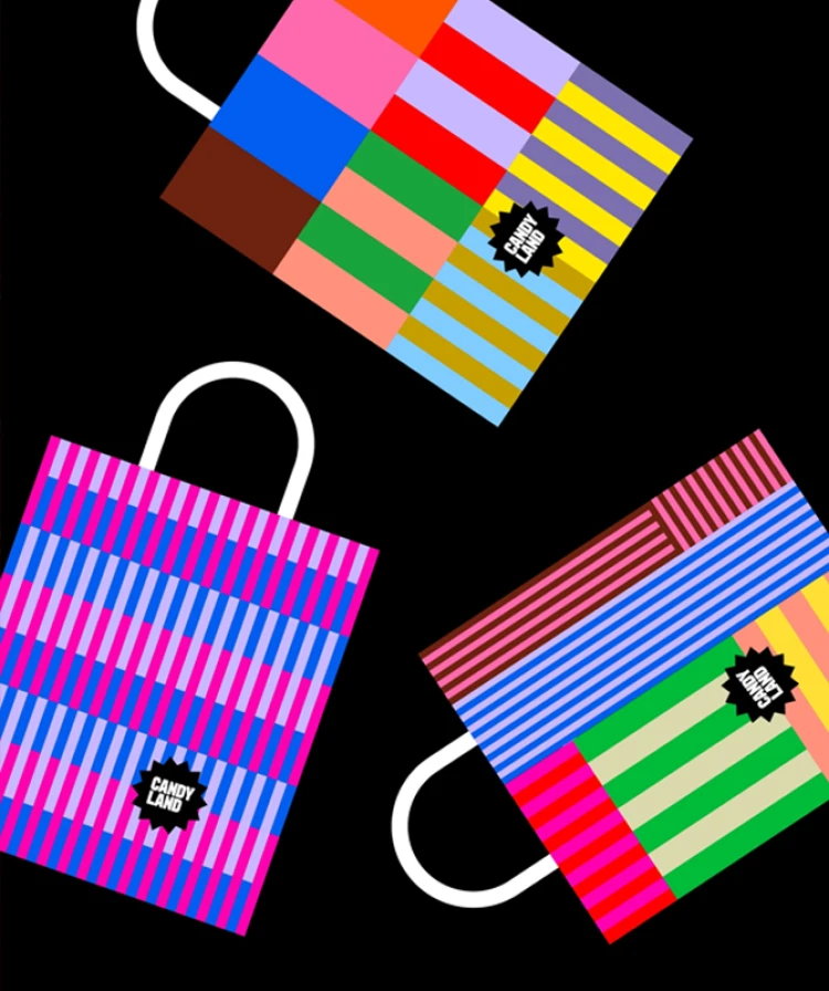
Owing to the expected popularity of Candyland, customers would telephone ahead to reserve their time slot, and on arrival would be greeted with a toothless smile while being presented with their very own, Candyland branded, pick 'n' mix bag complete with a ticket describing that its bearer was eligible for all the assorted candy they could carry.
Browse our latest design projects.
The personality behind Candyland
Like Alana, Gemma started her inspiration of striped sweet bags but just messed it up with the chaotic maximalism theme in her work. The bags are the epitome of the vibrant, ebullient joy that Candyland is known for, full of colour, bursting with lively, animated patterns—the perfect capture of the thrill of walking into a shop filled with candy.
As a guide, Gemma envisions the voice of the brand to be exuberantly fun and lightweight, teasing out your inner child. Her mock social media post below captures the playfulness of enjoying a range of different treats from the pick 'n' mix: foamy, fizzy, chocolatey, or creamy. It's all there, inviting you to hand-pick your favourites.
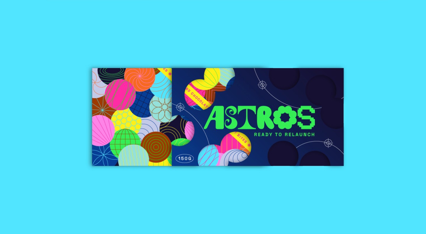
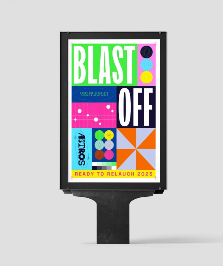
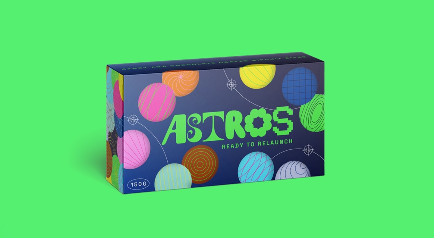
ASTROS by Laura
When scouring Pinterest, Laura was very much drawn to chaotic maximalism – specifically, to the jarring yet cohesive combination of colours and typography. While she loves bringing colour into a client's project, the opportunity to have fun with the graphic side of things isn't normally experienced – she was diving headfirst into it.
Inspired by the name of this candy – Astros, and the original packaging, Laura's creative vision extended further where she wanted the design to playfully give it elements of space. Furthermore, she wanted subtle icons and marks that would help enhance this design once again with some depth.
To achieve this, she cleverly drew inspiration from printing marks rather than relying solely on space-related imagery.
Discover how great design supports marketing.
Read more here
Striking packaging motivated by the galaxies and chaotic maximalism
Laura commenced sketching out each individual letter, drawing and sketching them, and then tweaking them so that every element would flow within the next. The concept for the brand was to encompass the idea that every planet and asteroid is unique, making it slightly reminiscent of a solar system, where independent self-standing pieces form together seamlessly into a whole, bearing in mind, of course, the chaotic maximalism brief.
The concept continued to the box design where she designed some planets with different patterns of lines that can layer and conflict with each other.
For a better visual impact, a paper sleeve is used in the packaging. On this sleeve design, we see several holes with some cut-out holes and randomly placed holes with a planet colour palette showing chaos of a maximalism style that is composed with a variety of planets.
If the brand were to come to life, Laura imagines some of the sleeve elements in UV gloss, reflective, and makes the logo very overlayed over the mass of colours.
Our designers' thoughts on the chaotic maximalism graphic design trend
Our observation from going down the line is that every designer has taken a different route with the directions of the chaotic maximalism brief. As we near our project's end, we wanted to succinctly capture what our designers said about the trend and how the brief has been for them. In their words, here's what each of them had to say…
“As a devout minimalist, calm and order have crept into most aspects of my life; how I choose to dress, how I style my home and ultimately, my graphic design style. That being said, every trend inspires a countertrend. Chaotic maximalism allows play with colour, pattern, shape, texture and layering which can have unique outcomes that are brave and full of personality. This brief pushed me out of the box but I do believe there is a fine line between creativity and chaos, however!” - Hannah
“As a self-professed chaotic maximalism lover, this trend aligns perfectly with my creative style. While interpretations of this trend may vary among individuals, I find the concept as a whole to be right up my alley. I thoroughly enjoyed the opportunity to exercise total creative freedom with this project!” - Alana
“The chaotic maximalism brief is right up my street. I am a self-confessed sugar and candy addict. My husband knows it, my family knows it, everyone in the office knows it, and now you know it. I have always had a massive sweet tooth so this brief was the perfect excuse to go out, buy some pick n mix (necessary for research purposes) and have some fun with my favourite thing. I wanted my concept to be fizzing with excitement to try and do candy justice.” - Gemma
“I enjoy the chaotic maximalism trend, there’s loads of inspiring stuff that sparks new ideas and ways of working with colour and typography. It’s fun to see brands experimenting with the trend and breaking the rules of more traditional branding and advertising which is often much cleaner. I’d like to use it more in future projects (paired back a touch) but it’s ideal for personal projects or loosening up and moving away from stricter design systems.” - Laura
Thinking about refreshing your brand?
Get in touch
Final thoughts on chaotic maximalism
Overall, the release from everyday duties allowed our designers the freedom of unscheduled time to be creative and truly feel liberated. Allowing one's team the chance to dabble and stretch their skill sets within projects is a wonderful way to up the mood and light some new fires of innovation for client projects.