Refining an established school identity for a new era
The Newcastle School is a private school that was merging from being an only boys school to a coeducational school. The school approached JUMP as they entered this new stage in need of a website redesign, campaign assets and design materials.
What we did

A new chapter for The Newcastle School
The Newcastle School, previously The Newcastle School For Boys, is a private school based in Newcastle Upon Tyne which welcomes students across the early years, juniors, seniors and sixth form ages. As the school was preparing to become a coeducational school, it had a desire to be seen as more inclusive to all families, which meant a change in name, brand, marketing and website.
Through refined brand guidelines, a distinctive creative direction, inclusive campaigns and a new website, we helped create an identity that reflected where the school was heading while retaining what made it recognisable.
Looking for a partner to guide your next project?
Get in touch
Evolving an identity
Becoming coeducational represented a significant change for The Newcastle School, but its existing identity already carried recognition. Rather than starting again, our approach was to carefully evolve what was already there.
We refined the school’s existing identity by simplifying the original school crest and removing references to the school being ‘for boys’. The crest's distinctive star was also brought into the wider visual language, creating greater consistency and visual elements across the brand.
The refined branding became the foundation for a wider visual direction; the brand guidelines were designed and introduced to symbolise a school that was sophisticated, proud, and inclusive to the school’s growing community. The new brand was then implemented into future designs like the prospectus and the website.

Putting pupils at the heart of the brand
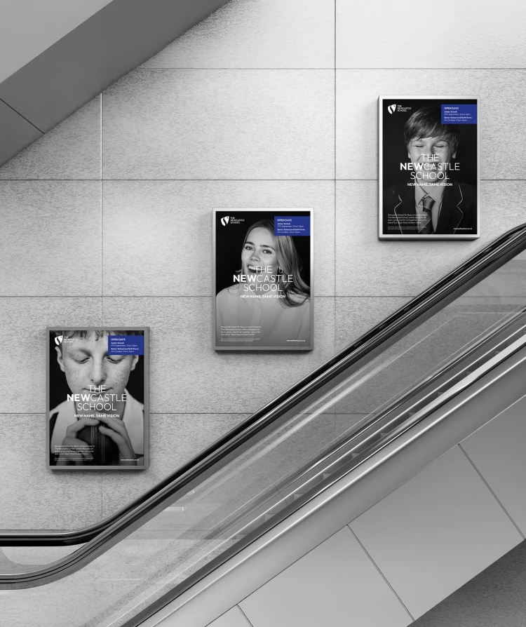
Black and white portrait photography became a defining part of the new visual direction, creating a sophisticated, editorial feel that contrasted with the school’s royal blue accent colour. The imagery needed to feel bold and distinctive, whilst still working seamlessly with the wider brand through the use of its colour palette, typography and visual elements.
Working collaboratively with an outsourced photographer and videographer, Unscripted Photography, we developed a visual approach that captured different personalities, interests and experiences across school life. Rather than simply showing the facilities, the imagery helped communicate the breadth of opportunity available and, importantly, that there was a place for everyone at The Newcastle School.
The photography not only supported the brand and was an authentic representation of the school, but it caught the attention of the audience and gave prospective families a consistent impression of the school at every stage for students.
A message with room to grow
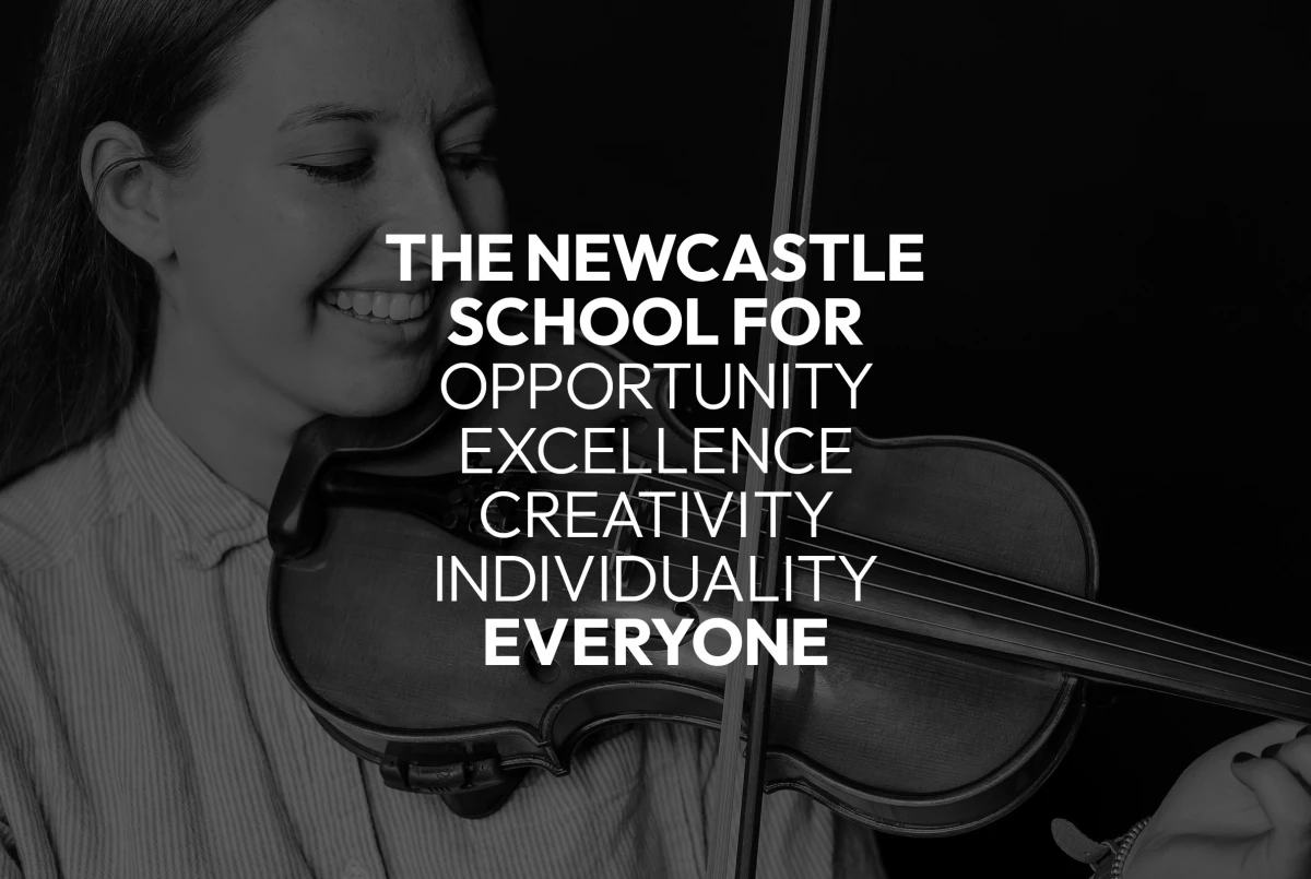
The rebrand from ‘Newcastle School for Boys’ to ‘The Newcastle School’ created a more open and inclusive identity as the school moved to coeducation. The message ‘The Newcastle School for…’ with various adjectives describing the school, became a key part of the launch campaign. For example - "The Newcastle School for opportunity." This gave a flexible way to highlight the different experiences, interests and opportunities available to pupils. From creativity to inclusivity, the messaging showed how the school supports pupils to explore their interests and find their place.
We brought the concept to life through a series of moving portraits, pairing the messaging with visuals that captured different students and aspects of school life. Used across the website hero and campaign assets, the portraits helped create an engaging and consistent visual identity that reflected the new brand direction.
Looking for support on your next project?

The whole project has come together perfectly and is a fantastic representation of who we are as a school. It has been a pleasure working with JUMP, their creativity and expertise really helped bring everything to life.
Alex Kingsland, Head of Marketing and Admissions
Creating a digital experience for every stage
For the website, the aim was to reflect The Newcastle School’s move to coeducation while making it easier for prospective families to understand what the school offers and find the information relevant to them. With a wide range of departments, year groups, activities and opportunities, the site needed to feel clear and accessible, while reflecting the evolved brand and building confidence from the first impression.
We reorganised the sitemap and navigation to create a more intuitive user journey, working collaboratively with the design team from moodboards and wireframes through to the final design and development. Clear calls to action guide prospective families from exploring the school to booking a visit, making an enquiry or beginning the admissions process.
Bespoke admissions and open day forms were also developed with flexibility in mind, allowing the school team to manage and adapt them through the website’s backend as needs change, while maintaining brand consistency. The result is a digital experience that makes researching and applying to The Newcastle School simpler, while supporting the school’s continued growth.
Interested in a new website to support your brand?
Get in touch

Bringing the new identity to life
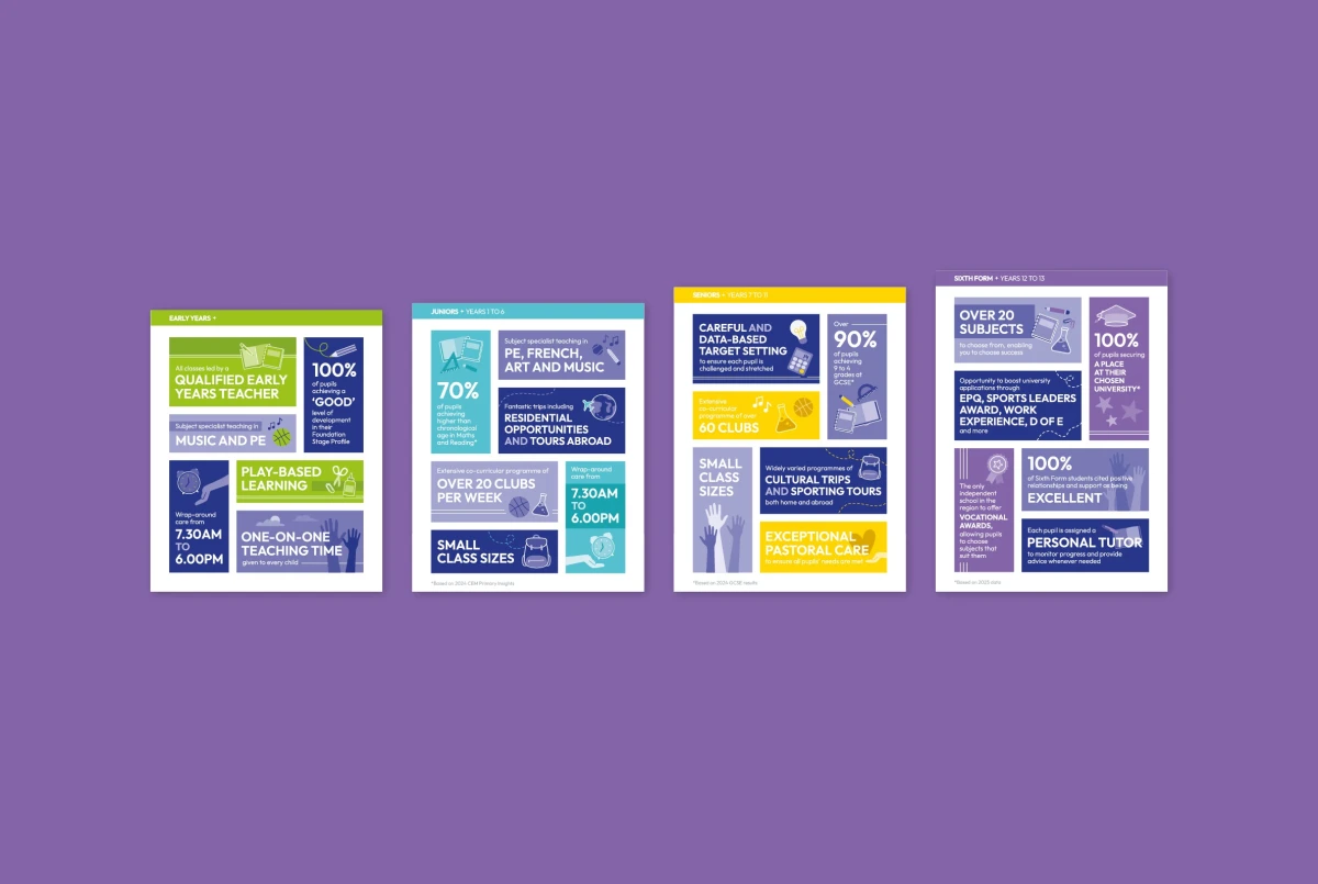
Bold outdoor advertising campaigns promoted the school’s open days, a refreshed prospectus with the new visual direction and messaging across digital and printed materials. Eye-catching photography and distinctive campaign messaging helped build awareness of the school’s new chapter, while retaining its established heritage and recognition.
From the first interaction with an outdoor campaign to exploring the website and booking an open day, every touchpoint now communicates the same message: The Newcastle School is ambitious, full of opportunity and open to everyone.
Together, these touchpoints create a consistent experience for the audience, communicate key values and leave a lasting impression on prospective families.