How do you design a website for everyone?
The Get into Newcastle website is run by Business Improvement District company NE1, as a resource for locals and visitors to get the most out of their city. JUMP was successful in winning the contract to redesign and redevelop the website, which had been in place with the current design for over 7 years.
JUMP’s User Experience Manager, Danielle Stone led on the design of the site and worked with JUMP’s development team to create the final site. We asked Danielle how to approach a site that is aimed at everyone...
Who was involved in the project?
The key team was led by Creative Director Lucy Batley, Head of Development John Shepherd and myself, User Experience Manager. We met weekly with the client and worked directly with them throughout the project. The research phase involved the whole design team, and several developers to feed into the process.
With a fixed budget and a potentially large site to create, where do you start with a project like this?
It sounds obvious, but we always start with the client’s brief. This is a hugely important part of any project at JUMP, taking the time to understand what we are being asked to do and what is important to the client. It’s also not just about the brief: we immerse ourselves in our client’s organisation to fully understand what they do and what they are trying to achieve. In this case, NE1 wanted to be the go-to site for events, offers and venues in Newcastle.
Given the scale of the project and the fixed budget, how do you focus your efforts at the beginning of the project?
Having spent time understanding the brief, we defined that the ability to search and browse easily and the quality of the content itself were the two key factors in making the website successful. These two areas became our focus for the research and exploration phase.
The Get into Newcastle site audience is potentially anyone in the Newcastle region and visitors, does it make your job difficult when the target audience is so broad?
Yes this did create a challenge for us as it can make it harder to make decisions on how to ensure a good user experience. To help us with this, we created user personas to help us understand user motivations. These are examples of real or fictional users that are representative of certain types of users. We spoke to Newcastle residents and asked them what they might be interested in finding out about events and offers in their city to help us create our personas.
How did this help?
From the user research, we started to see two types of users emerge, based on their motivations. The first was a ‘Show me’ user who wanted to find a specific thing within a specific timeframe, e.g. Someone wanting to see pizza offers on a Thursday evening. The other user was an ‘inspire me’ user who wasn’t coming with any expectations, but wanted to explore great events and offers in Newcastle.
The ‘show me’ and ‘inspire me’ user types formed a benchmark for us to test out our ideas for the search aspect of the website.
What did your research phase involve?
As always, this is the most important part of the project for us and we allow plenty of time for this phase as it always ensures a better outcome. We explored hundreds of websites that met similar challenges; searching, finding results, wanting to see something specific and wanting to be inspired and excited by events. We also looked at sites that had to display large amounts of useful information that was organised and easy to navigate. Mobile formed a crucial part of this exploration as a high proportion of website users were using mobile devices to browse the current site.
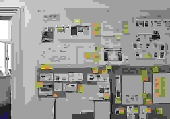
One of our research boards during the design phase
How do you assess whether a site you are researching is good or bad? Is the ‘number of clicks’ a factor?
Number of clicks can be a useful thing to investigate but it can be a simplistic way of looking at things. Of greater importance is the clarity of the process, how easy and simple it is to move around the site, understand where you are and where you can go next. Think about moving around an airport or a hospital, four very clear signs are going to cause you less hassle than two badly positioned or badly designed signs.
After your research phase, what were your aims for the new site?
We wanted users to get an instant sense of a vibrant, happening Newcastle with lots going on and lots of reasons to get out there and enjoy the city. Secondly, we wanted users to browse or search for offers, events or venues quickly and flexibly. Users in general don’t follow a logical, linear process. We created a site where they could look for pizza offers on Friday and then check out music events in October without even feeling like they’ve really left the home page, and without them feeling like they were stuck down a particular route.
The original NE1 Get into Newcastle website
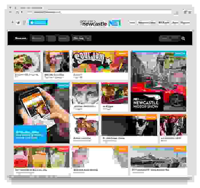
The new NE1 Get into Newcastle website
What considerations did you make for mobile?
Speed is essential on mobile and we worked hard to make the site faster than its predecessor on all devices. Our object-oriented design also meant that individual elements of content could relate and link through to each other, becoming the form of navigation rather than the user having to navigate back to a main menu. Not relying on a persistent navigation in this way makes a site much quicker to get around on mobile. For example, if I end up looking at an ice-skating event on mobile, I am presented with the option to view other events in a similar space; family, outdoors or active events for example, which might give me new suggestions without me having to start my search process over again.
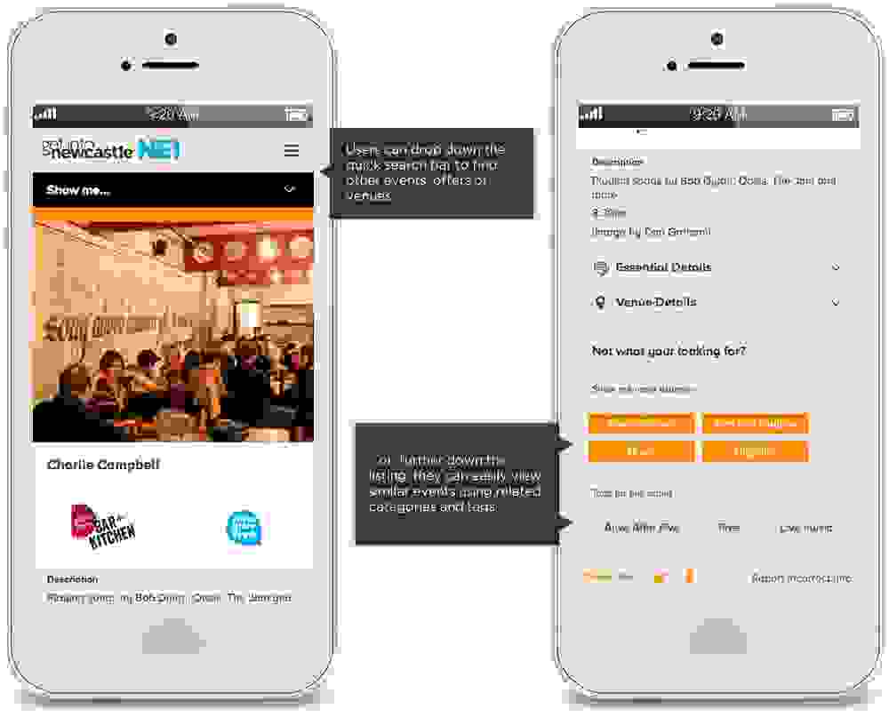
A photo of browsing events on mobile
What considerations did you make for mobile?
Speed is essential on mobile and we worked hard to make the site faster than its predecessor on all devices. Our object-oriented design also meant that individual elements of content could relate and link through to each other, becoming the form of navigation rather than the user having to navigate back to a main menu. Not relying on a persistent navigation in this way makes a site much quicker to get around on mobile. For example, if I end up looking at an ice-skating event on mobile, I am presented with the option to view other events in a similar space; family, outdoors or active events for example, which might give me new suggestions without me having to start my search process over again.
What were the biggest challenges in the project?
I’d say probably timescales as it was a tight turnaround. The huge challenge was taking the content from the old site and transfer it into the new, adding thousands of new images to make the site impactful and true to the design which had won us the pitch.
What made the content such a challenge?
The old site was WordPress based and structured in a completely different way to our new one. For this project, we felt that rebuilding the site from scratch would help us to make it completely fit for purpose, keeping the data better organised and improving speed for users. Transforming the data to fit into the new structure in the right way from the previous incarnation was no mean feat, thankfully our lead developer on this project Chris worked tirelessly to make sure everything went smoothly, ready for the deadline. Chris also ensured that the website integrated with the NE1 app which is synced with the website.
What happens after the website is launched?
The website has just been launched (June 2016) and our next steps will be to closely monitor the analytics. We will be monitoring the site to ensure users are continuing to engage in the site, we are expecting to see improvements in several areas and have some key targets to increase user engagement in certain areas. NE1 Restaurant week for example is hugely popular, we’d like to encourage Restaurant Week visitors to explore and engage with the rest of the site when they come for their Restaurant Week offers. Our other goal with analytics is to explore user patterns that we can exploit or improve on, so that we can make suggestions to our client to continuously improve their site. We like to work in partnership with our clients and we see this as an ongoing process to ensure the Get into Newcastle site continues to be successful for them and their customers.
You can see the site here: www.getintonewcastle.co.uk