National Wine Week: wine and design
It is said that every empty bottle is filled with a great story… and we agree. But what about the designs behind the wines? For many, the small bit of paper that covers the usually standard glass bottle tells us a story that we associate with our favourite wines. As National Wine Week draws to a close - persuading consumers to drink less but better - our designers share their favourite wine designs.
Lucy's pick -
Joseph Swan Vineyards
Not an obvious choice for our Creative Director Lucy Batley but she has selected a design steeped in local history… Lucy says: “My parents went to the family winery in California and when they told the owners that they were from Newcastle they were overwhelmed. It turns out that they had fallen in love with a Thomas Bewick print of a swan (which matched their family name) and bought an original print at an auction in New York. The swan now adorns the bottles of their full range of wine. Thomas Bewick was an English engraver born at the now National Trust run house at Cherryburn, in the village of Mickley, Northumberland. We are also the proud guardians of a blue plaque just outside our office in Milburn House. The plaque celebrates Bewick’s copperplate print workshop on this site from about 1790. A beautiful engraving, a fascinating history and a superb wine!"
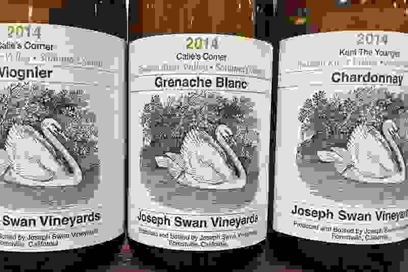
Photo credit: Vinopolis
Hannah’s pick:
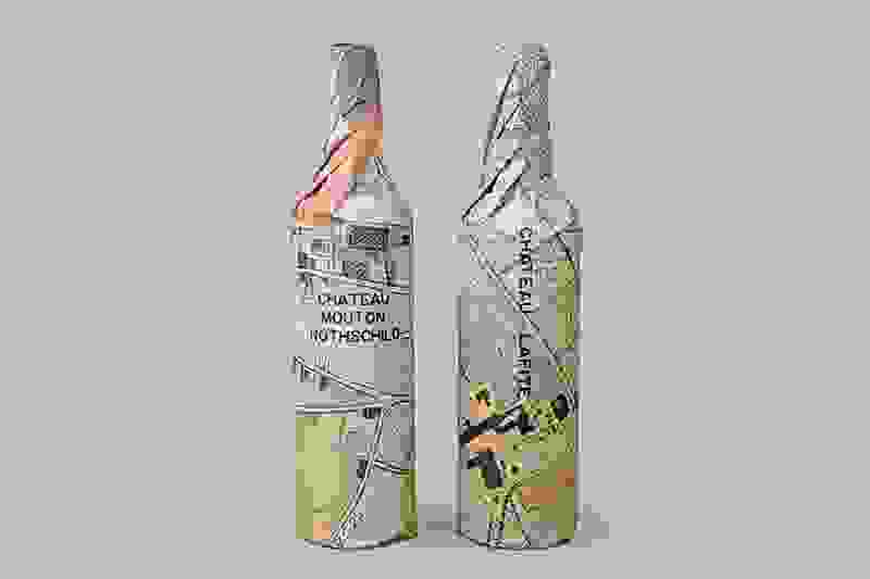
Rothschild Collection, Waddesdon Wines
Waddesdon Manor is the historical house of the Rothschild family in the UK and home to Waddesdon Wine, the official distributor of the Rothschild wine collection. The Rothschild Collection was designed by Paul Belford in London, featuring a beautiful wrap which uses the Waddeston estate map as the pattern surrounding the bottles. It is said that Belford tried to balance tradition with a more modern approach to the wine business.
Info/photo credit: The Dieline
Adrian’s pick:
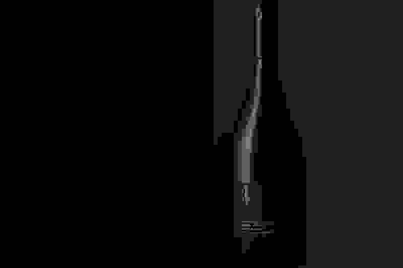
#4 Pinot Noir, Sokol Blosser
Sokol Blosser is located in the North East of Dayton, Oregon. “#4” is a collaboration between Sokol Blosser Winery and Allied Works and a limited release of their finest 2012 Pinot Noir, exclusively available to club members of the 100-acre vineyards in Oregon’s Dundee Hills. Allied Works said that their inspiration came from the vineyards provenance, resulting in something that is direct, textured and elemental.
Info/photo credit: Allied Works
Marie’s pick:
Wayward Wines
Marie’s Pick is Wayward Wines, a new concept for wine that defies typical category cues and shuns industry snobbishness. The aim is daring, distinctive flavours, boldly expressed. Branding agency Robot Food wanted to create an expressive, accessible brand of wine, positioned to “bring some relevance back to a stuffy category”. The bold colours and striking patterns make for a disruptive brand that stands out from the crowd.
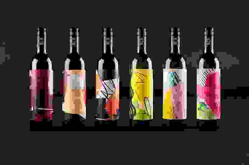
Info/photo credit: Robot Food
Andy’s pick:
K de Korta, KORTAWINES
K de Korta is an iconic wine of KORTAWINES, Bodega & Viñedos Korta Bucarey, a Chilean vineyard with Basque roots and designed by Ole Büro. The die cut K was designed to “let us see clearly this unique wine, which expresses the honesty of the Basque character”. It is an elegant looking wine to match a signature blend, standing out for its simplicity and complementary colours.
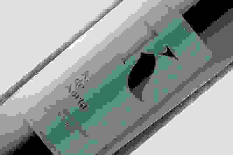
Info/photo credit: The Dieline
Rachel's pick:
Orkney Red, Orkney Wine
Our designer Rachel is from The Orkney Islands, so her choice stems from a soft spot for the homeland. The story of Orkney Wines starts with Emile van Schayk, who moved to Orkney, won several wine competitions and set up training on the Islands in 2001. The wine has a unique design with a shape and design of wine bottle that is different to anything else that was seen at that time.
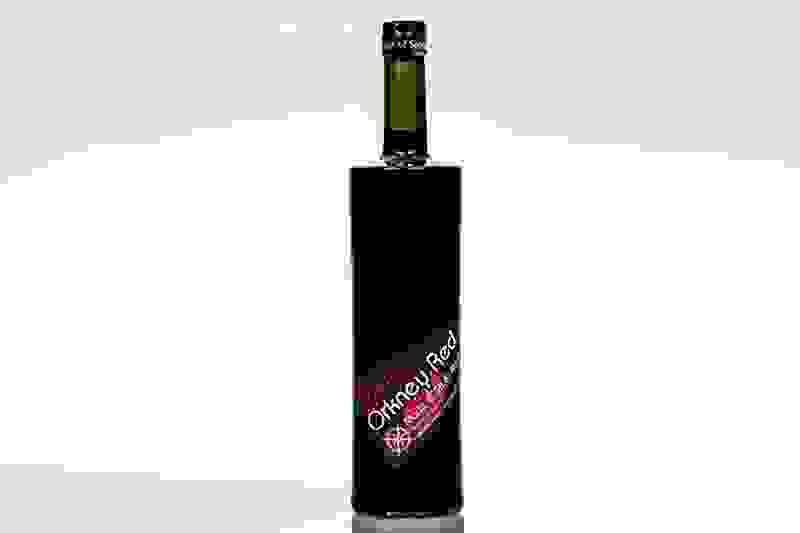
Info/photo: Orkney Wine