The Rise in Alternative Film Posters
In today’s oversaturated market of superhero movies and action thriller sequels we are faced with posters (and plot-lines) that we feel we’ve seen a thousand times before. However, there has been a trend in the production of limited edition alternative posters celebrating cult classics.
Have you ever wanted to own a little piece of film history? What about Han Solo’s jacket from The Empire Strikes Back? If you happen to have a spare one million pounds available (as estimates would suggest) for the Prop Store Auction, then the jacket belonging to the galaxy’s most beloved scoundrel could be yours.
Holding up a mirror to society, films allow audiences to escape the day-to-day norm and be transported to galaxies far, far away. Films can define a decade, or a generation, so it is no wonder some fans and film-buffs alike want to own a part of the films they identify with. But what if props and costumes aren’t for you?
As a graphic designer, I am drawn to the posters used to advertise films. Despite the perceived repetition, there is a formula as to why posters look the way they do. As well as having to please actors and executives from the film studios, posters have to sell the film in a single image to the general audience (not just savvy and scrutinising designers). As a result, studios rely on a tried and tested layout to convey the type of film it is and to keep their top-billed actors satisfied. As an audience we are reminded of a similar film we’ve already seen and are encouraged to watch it by the comforting familiarity of it all - we know exactly what we are getting.
There is, however, a growing market for alternative film posters. Often released as limited edition screen prints for one-off screenings or as commissions; artists are creating their own interpretations of iconic films.
Taking a closer look at the dramatic themes is something the design team at JUMP is familiar with through our continued work with the People’s Theatre. We aim to distil the themes of the plays into minimal posters filled with double significance. We are able to take advantage of how familiar the audience is with the play, creating visuals with deeper meaning that give the viewer that ‘aha’ moment when they see the double meaning. Alternative film posters too can play on the fact that the audience, or customer, already knows the subject matter. Additionally, they can break from the established conventions for promoting upcoming films as they are being targeted at existing fans of the film, not a new audience.
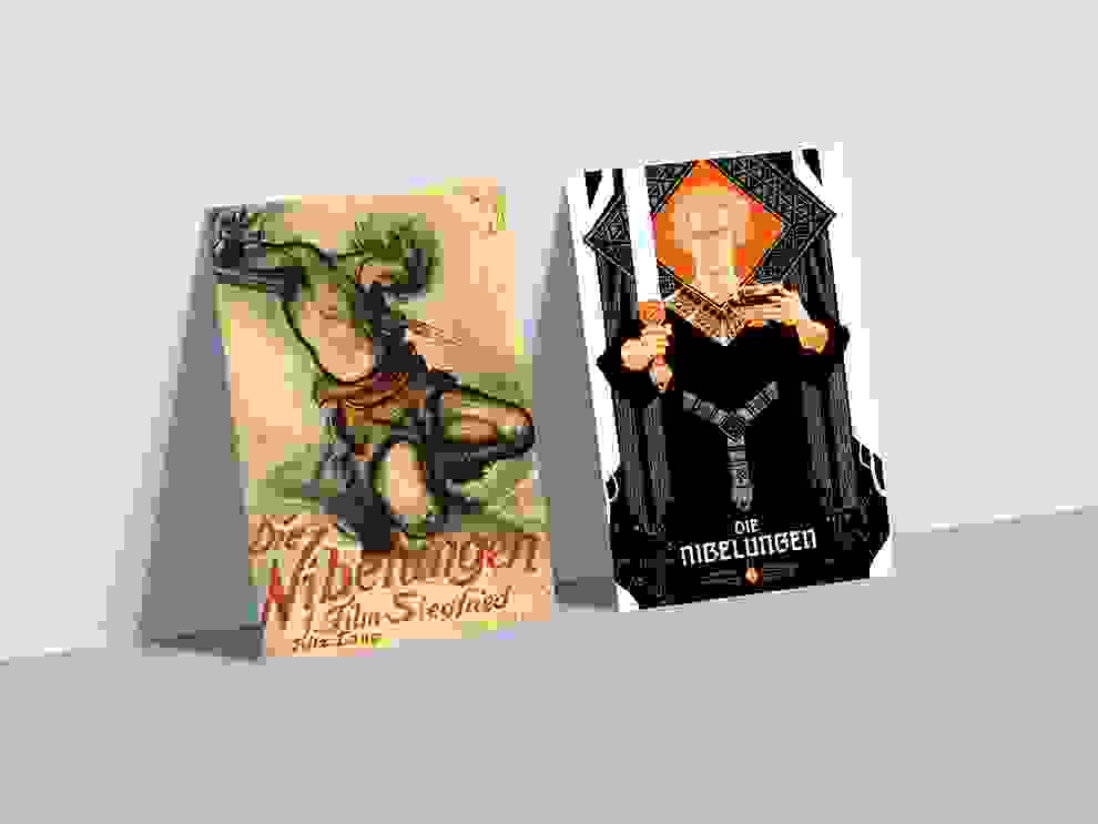
Director Fritz Lang is most well known for his silent film ‘Metropolis’ (1927), however three years earlier he released an ambitious story in two parts - ‘Die Nibelungen: Siegfried’ and ‘Die Nibelungen: Kriemhild's Revenge’ - based on the epic poem ‘Nibelungenlied’. The original theatrical release posters, while vividly expressive, look akin to a more traditional way of depicting poems, like Pre-Raphaelite paintings.
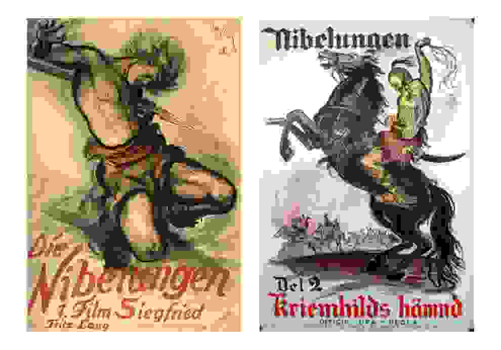
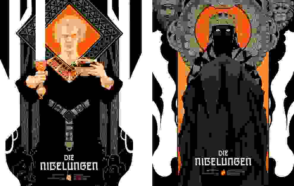
Nearly a century later a set of reimagined screen printed posters celebrating the films have been released. Created by illustrator Peter Diamond and sold through Black Dragon Press in the UK, the limited run of 70 copies each sold out almost immediately. The design pays tribute to the Art Deco origins of the film, whilst also paying a nod to the artist Alphonse Mucha and illustrator Aubrey Beardsley. Depicting the protagonists and shifting tone of each film, Diamond explains of his work, “Given the pretty straightforward hero tale of 'Siegfried', I expected that the widow of the murdered hero would in turn be the heroine as she takes over in 'Kriemhild's Revenge'. But there's no heroine. She gets her revenge but becomes a monster in the process.
I've designed the posters with that in mind, aiming for a unity of style between them while still reflecting that contrast in tone and in the characterisation of the leading figures. The colour scheme is inspired by the warm golden tones laid over the black and white in the original version of the films.”
Despite being distinctly different in style and execution from the originals, the reimagined posters still capture the essence of the films.
While ‘Die Nibelungen’ might not be on everyone’s film radar, either people loved the films or the prints enough for them to sell out so quickly. A more modern classic, and perhaps more well known, is ‘The Graduate’ which celebrated its 50th anniversary last year.
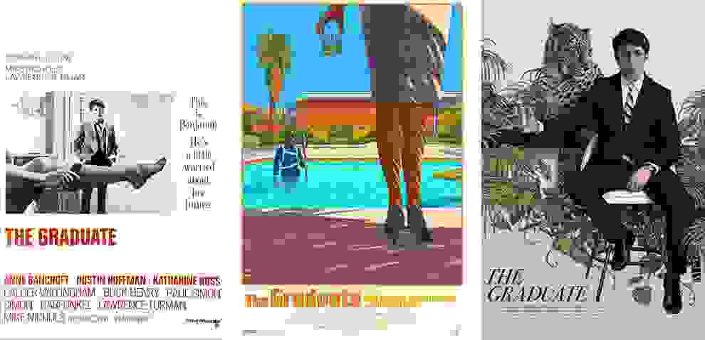
Given the film’s iconic status (and soundtrack) it comes as no surprise that it has been reimagined in poster format numerous times. Illustrators Laurent Durieux and Rory Kurtz have both turned their hands to the seductress Mrs Robinson and the aimless Benjamin Braddock. While both posters strike a similar tone to each other and the original, they go about it in different ways, allowing for the individual style of the illustrators to come through.
The infamous scuba scene, as depicted by Durieux, represents Benjamin’s loss of control over his life and the feeling of being trapped by his parent’s choices for him. Kurtz too manages to express the lack of control and notion of being trapped, but this time represented by the leopard looming dangerously close to Benjamin as he’s swallowed up by the jungle of house plants. It is also interesting that both posters show Mrs Robinson in leopard print/guise, but they go about representing it in different ways. Whichever design you prefer, both posters still feel very much a part of ‘The Graduate’ while remaining unique to each illustrator’s style.
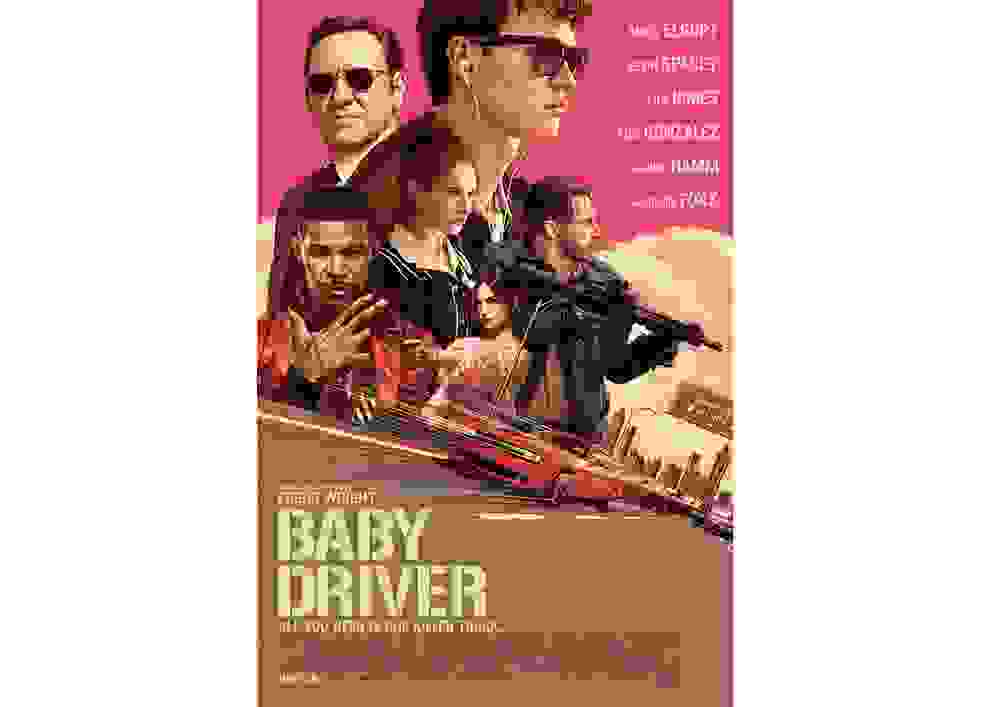
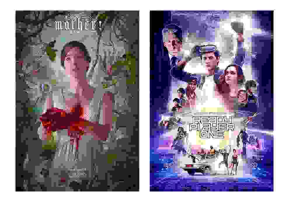
The impact of illustrated work by Rory Kurtz has reached beyond limited releases, when he was commissioned to produce the official artwork for Edgar Wright’s ‘Baby Driver’. While the illustrated style pays homage to movie posters of old, it still follows common tropes of film posters we see today - an ensemble cast with the actor’s names displayed prominently. Despite an increase in illustrated posters being used as the main advertising for new releases, like Mother! and Ready Player One, I don’t think we’ll see a full revival of the style for mainstream cinema.
Special editions are exactly that - special. Being released in small batches makes them covetable, and the increased freedom artists have over them allows them to craft their own love letter in tribute to their favourite films. I’ll leave you with some of my favourite alternative posters to swoon over.
Find the artists on Instagram
@peter_diamond_art– Die Nibelungen
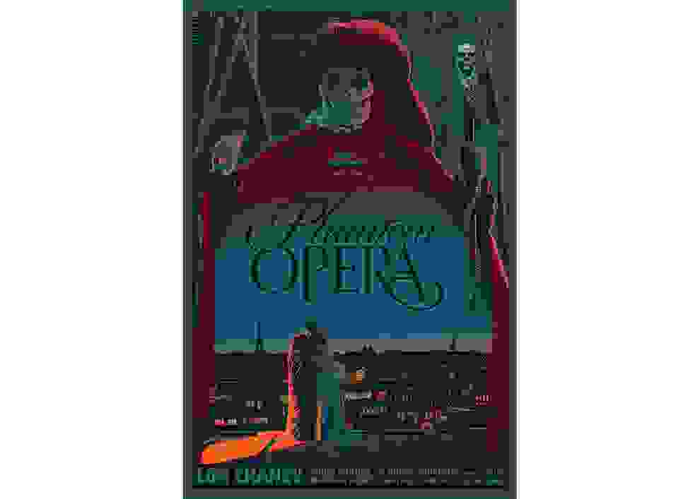
@laurent_durieuxillustration– The Graduate, The Phantom of the Opera
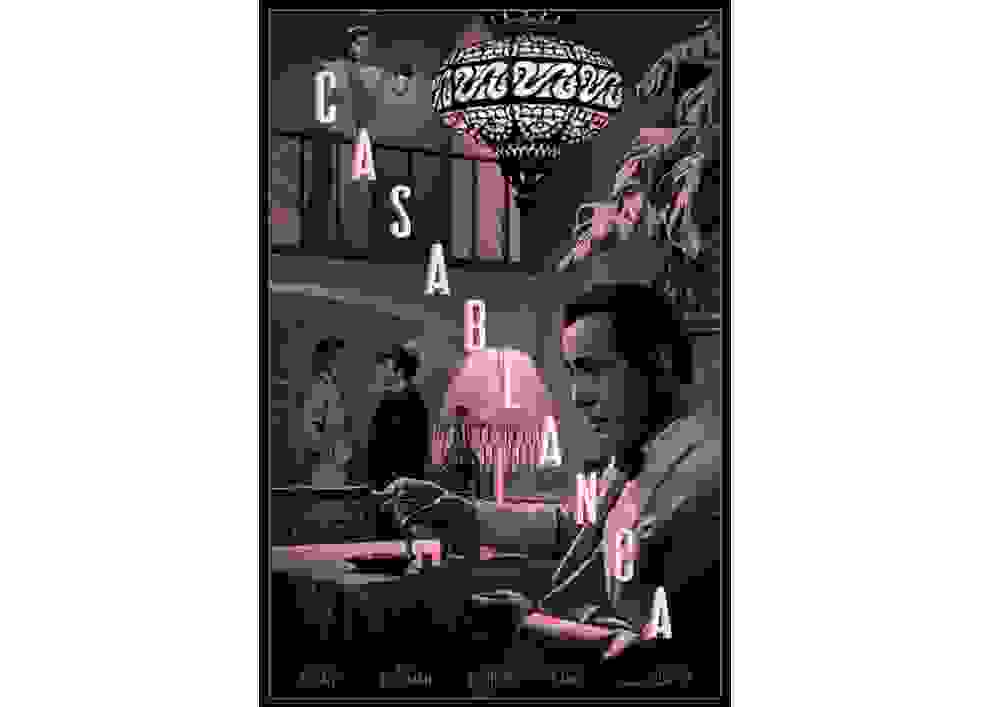
@rorykurtz– The Graduate, Casablanca, Baby Driver
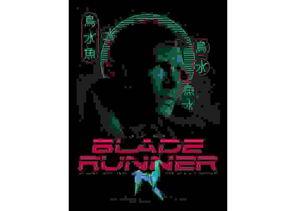
@tracieching– Blade Runner
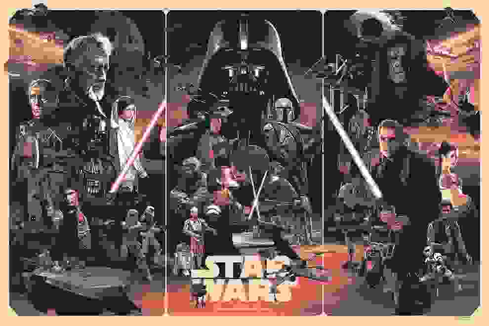
@grzegorz_domaradzki– Star Wars