Quick tips for improving website accessibility for all your visitors

At JUMP, we strive to make solutions that help our clients reach a wider audience. By making your website as accessible as it can be, you are making sure that all your potential visitors will be presented with a decent and enjoyable experience.
In a lot of cases, making websites accessible can be seen as a costly, or long drawn out process, but it really doesn’t have to be. There are some quick wins you can implement today that will immediately make your website a better experience for all your visitors, not just those who need that extra support.
Poor colour contrast
The colour combination you choose when building a website drastically impacts the readability of the content. A bad colour combination can make or break readability on your website.
Sometimes, this is obvious: blue text on an off-blue background will be difficult for everyone to read. However, when you consider that 1 in 12 men, and 1 in 200 women in the UK have some form of colour blindness, you realise that it’s important to be more mindful when considering the colours you use.
When you’re choosing what colours to use, there are a few tools you can use that will compare the combination against the WCAG Contrast and Colour Guidelines:
Stark (a plugin for your browser or design application of choice)
You can also check it within the development tools in your browser
While you can always aim for AAA standard, achieving the AA standard will give you a sizable boost in readability and will allow your text to be read by those with moderately low vision.
Missing alternative text
When you add images to a website, make sure to describe them wherever it's needed.
If an image adds additional meaning to a page, or contains text itself, you should be looking to describe them to the end user, just in case they cannot view the images themselves:

On the other hand, if an image is purely decorative you should include an empty alt tag rather than not including an alt tag at all.
Sometimes knowing when to use alt text can be tricky, but this decision tree can make it a bit easier for you.
You also do not need to state in the alt text that it is an image (image of a puppy, for example). This would be redundant, as screen reader users will already know that it is an image at this point.
Missing focus states
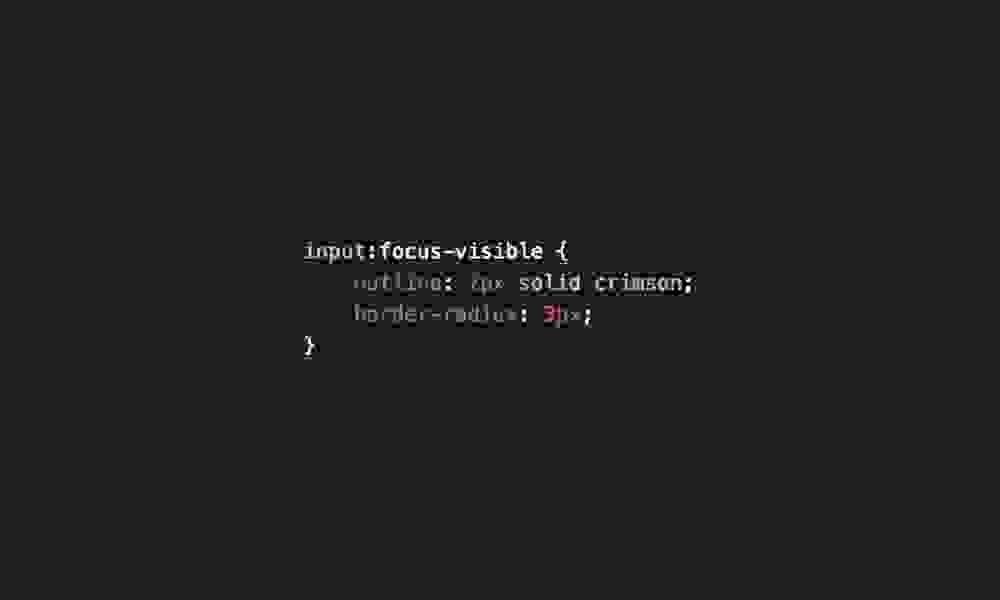
While many of your website visitors will use a mouse to navigate around the page, blind and low-vision users, as well as those with mobility issues may be using a keyboard to navigate through the links and buttons on your website. For this reason, it’s very important that you provide visible focus states where possible.
In the past, many websites have hidden the focus states because they would appear on click as well as focus. This results negatively to the design of the page. However, thanks to the CSS pseudo-class focus-visible, modern browsers now allow you to add focus states for those that need them, and keep them hidden for those that don’t:

It’s vital that this is included so users who navigate with their keyboards can always follow where they currently are on your webpage.
Missing languages
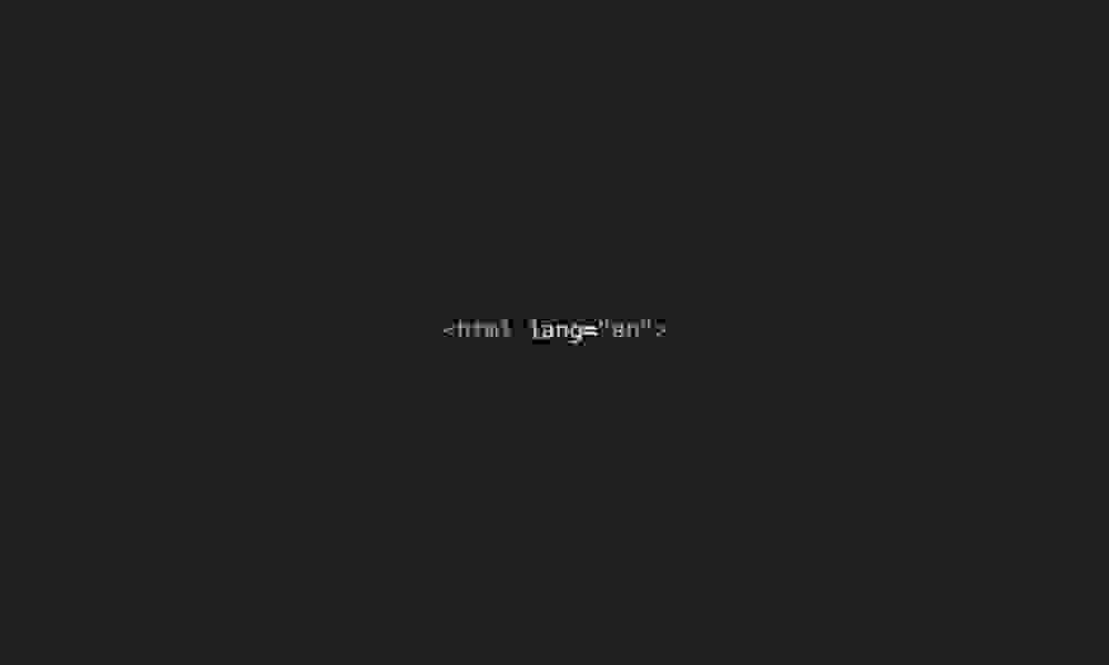
There’s a change you can make that will get you a pass on a couple of the WCAG Criteria and all it takes is a few characters of code!
Make sure that you add a lang attribute to your HTML element to let visitors know what language the content on your website is in:

If you don’t include this, screen readers will assume the website is in the default language that the user selected when setting it up, potentially making it impossible to understand the content.
Auto-translation tools like Google Translate can use this to determine whether or not to offer up translations for the content on the page for you.
You’ll also find that this attribute is used by screen readers to determine the correct pronunciation and accent of the content itself.
Structurally unsound HTML
One of the best things you can do to make your site more accessible is to simply write structurally sound HTML.
There are many tags available to developers to help convey extra meaning in the components that they build. For years, the majority of the components of a web page would be wrapped in the humble div tag. While the div tag is still an important tool in structuring out a website, there are many more options available to you that help bring more meaning to the code you write:
When structuring your pages, make sure you have your header, main and footer structural elements in place.
Make sure you define your headings with the h1-h6 tags, and make sure each heading level follows on in sequence. Every page should have a main h1, followed by h2s and so on. Just like in a traditional document or article.
Make sure all your links are using the a element, and all buttons use the button element. As a general rule of thumb: use a elements for linking to other pages or websites, use button elements for submitting information or triggering a process.
Have an area dedicated to your primary navigation links? Use a nav element.
Have an area containing content that is considered separate from the main body of your page? Use an aside element.
This is just the tip of the iceberg too; using the correct elements in the correct situations help give screen reader users an idea of how your website is presented and structured without being able to see it.
In conclusion
The biggest takeaway here is that all of the HTML elements and techniques that have been in place since the very start of the internet are all inherently accessibility friendly.
Good accessibility benefits all users, and with these tips you can allow more and more people the opportunity to enjoy the websites you create.