The Need for Responsive Logos
Responsive web design is nothing new. According to one source, by the end of 2018, 79% of global internet use will be accessed via mobile, yet in 2017, nearly 60% of total time spent on websites occurred on desktop. So despite the increase of mobile traffic online, the larger format desktop is still an essential consideration in web design. As viewers we’ve come to expect responsive websites to match our varied browsing habits, but now we should also be thinking about responsive logos to make for the best online experience.
Designing Logos for the Digital Age
Logos come in a myriad of shapes, sizes and styles, and they can have multiple applications depending on the company they represent. Some logos are only ever seen online, while others transition from packaging and swing tags to vehicle livery and building signage, so whatever the final design is it needs to be versatile, but that shouldn’t mean that a logo is restricted to one version to serve all purposes.
As designers, we consider many things when designing a logo. Aside from the semiotics of logo design, we also look at the practicalities - does it work in full colour, mono and reversed? Now we should be vetting our designs on another factor - how does it respond across different devices?
A truly responsive logo has not just been resized for use on smaller screens (though this can work for minimal designs), as resizing often leads to elements losing detail and can have an impact on legibility. This was precisely the case for Newcastle University.

Newcastle University
Newcastle University is one of the UK’s great redbrick universities. Founded in 1834, today’s University has grown to host more than 26,400 undergraduate and postgraduate students across their campus in Newcastle and international brand campuses in London, Malaysia and Singapore.
Following the launch of three international campuses, the Newcastle University’s logo grew to reflect their global reputation by adding the strapline ‘UK | Malaysia | Singapore’. JUMP was commissioned to consult on the ‘internationalisation’ of the University brand.
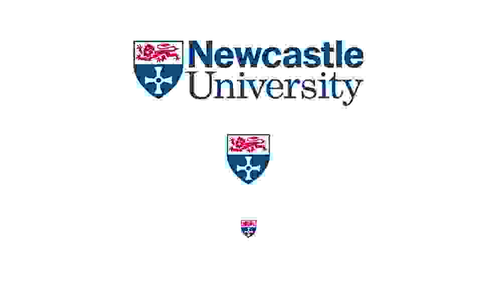
The proportions of the University logo, with the crest aligning with the top of the logotype yet descending below it, created problems on the web. While the text was legible at most sizes, the detail of the lion (affectionately known as Percy) deteriorated as soon as the logo was reduced from the size it appeared on desktop. The decision was taken to redraw Percy to make the logo suitable for the digital age.
Redrawing Percy
Percy fell victim to loss of detail at smaller sizes. His features were lost and any definition blended into one. The new design was streamlined while still retaining his overall character. Fine lines were thickened, and the crest reduced in height (but not width) to eliminate the awkward spacing issues faced by the old logo. As a result, the logo could be used across a wider range of sizes before the details started to deteriorate.
When moving down to smaller screen sizes, the logotype was dropped. This allowed for the crest alone to be displayed at a bigger and more legible size than if it had still been part of the full lock-up. The standalone crest is not just for use on the mobile version of the website but also doubles as the identifying marker of the University across social media platforms.
We also created a further simplified version of the crest for use at sizes below 35px in height such as a favicon and other small applications. Again, lines were thickened, while we also made Percy completely solid.
The new suite of logos, from the full logo to the standalone crest and the further simplified crest, allows the Newcastle University logo to flow as easily between digital devices as we ourselves do. Just as responsive web design has become an essential part of the process, then so too should responsive logo design. If anything it should allow designers more freedom in their designs, no longer having to be constrained by the question of “how will it work on mobile?”. The answer is “it responds”.