Fedrigoni
Made in Italy. Designed in the UK.
A prestigious invitation
Imagine being chosen to pose for the cover of Vogue magazine? Well that’s what it felt like when world-renowned paper manufacturer Fedrigoni invited JUMP to submit a design for their celebrated Fedrigoni 365 book. More importantly, we were the only North East agency to submit a piece of original artwork.
A historic and well-respected name
The Fedrigoni name has been linked with prestigious paper-making as far back as 1717, when budding paper merchant Giuseppe Fedrigoni founded the San Colombano paper mill in the ancient northern fortress town of Rovereto, Italy.
Since its foundation, Fedrigoni has specialised in fine paper for printing, editing, labels, bookbinding, packaging and paper products.
While this remains very much at the heart of the business, by collaborating closely with customers, Fedrigoni also creates specially customised paper products.
The brief
Fedrigoni 365 is an annual project which commemorates the forthcoming year by asking leading UK-based creatives to contribute a piece of work to a design compendium, which takes the form of the Fedrigoni annual calendar. The result of this process is a striking tome that holds 365 single-colour designs within.
Fedrigoni asked that we interpret a specific number and date that was allocated to us. This could be either a literal or an abstract interpretation. For example, if you are given 7 February, you will be expected to interpret the number 7, the design could be influenced by anything to do with the given number, date or time of year. However, we were asked to keep in mind that Fedrigoni wanted the result to be a book of numbers, or graphics influenced by numbers. Therefore, the allocated number should be a core element of the design.
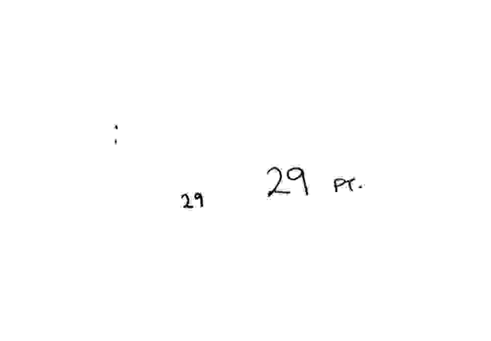
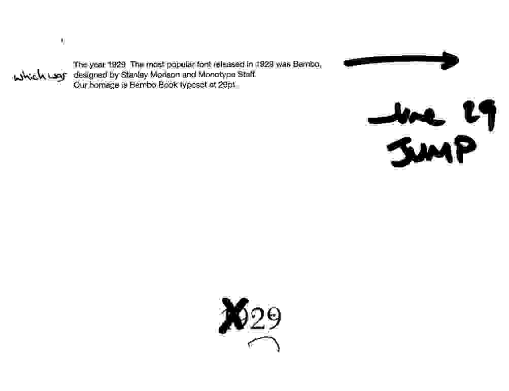
Our allotted number was 29 June.
The design
We decided to run the page concept design as an internal competition amongst the design team at JUMP. Following our design process, we collectively brainstormed themes and ideas and then met to discuss sketches and our thoughts.
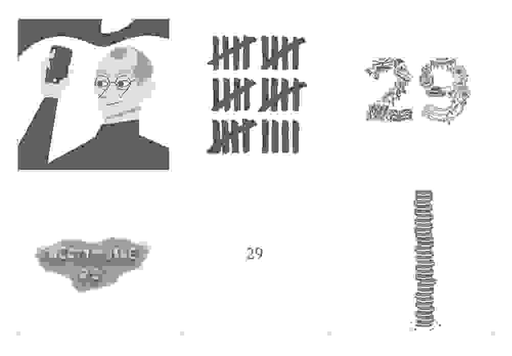
Initial concept:
Worked up idea:
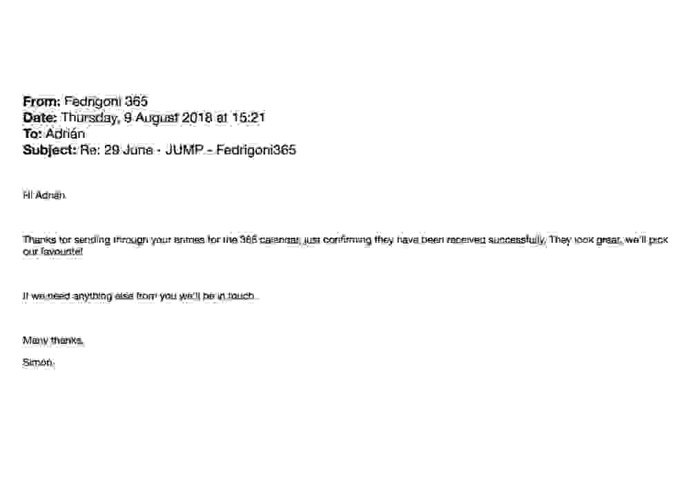
We couldn’t decide which of the shortlisted six designs to submit, se we sent all of them to Fedrigoni for them to choose their favourite:
To which they kindly obliged, responding as follows:
The long wait
We then had a long wait to find out which of our six designs had been chosen. This became a running joke in the office each designer professing to be worthy of becoming the Fedrigoni ‘chosen’ one. We were then tipped off that there was a 12 second video on Instagram which rapidly pans thorough all 365 pages of the calendar:
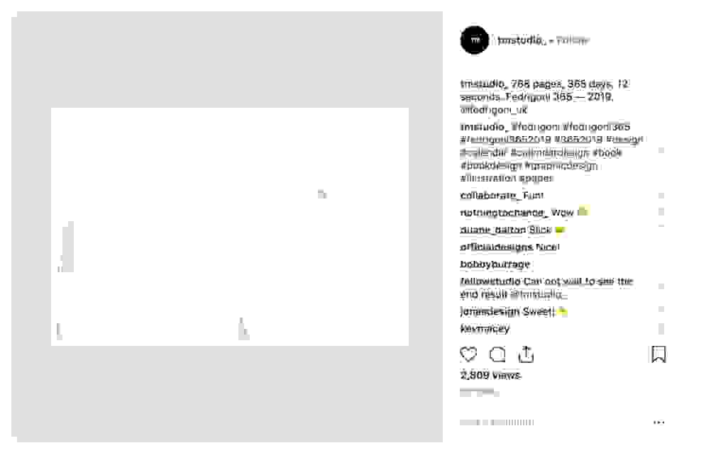
The designers painstakingly flicked through the video freeze framing to find the page of 29 June 2019 to reveal the chosen design and the JUMP internal competition winner…
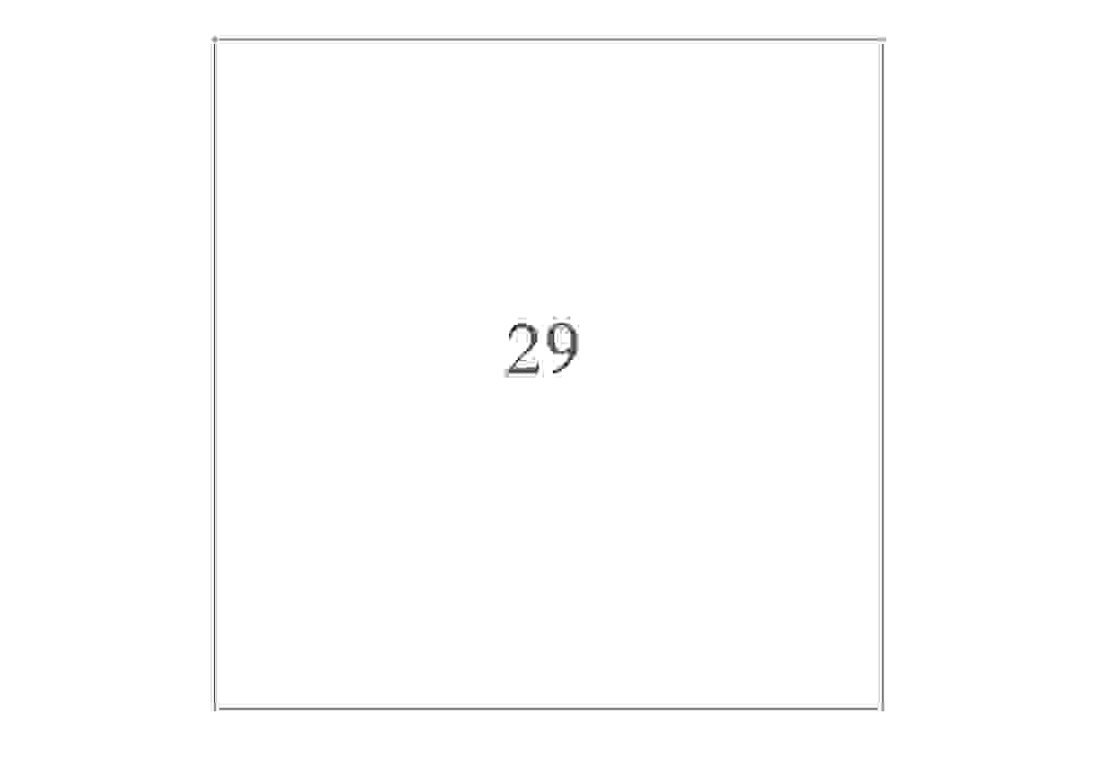
In the year 1929, the most popular font released was Bembo which was designed by Stanley Morison and staff at Monotype. Our homage is Bembo Book typeset at 29pt.
The winners is…
Much to the surprise of the design team and the delight of the winner, the chosen design was created by our Co-Founder and Creative Director Lucy Batley. Cue lots of victory dancing accompanied by the cries of “I’ve still got it!! I’ve still got the magic touch!!”.
When quizzed on her interpretation of the brief and how she came up with the concept, Lucy commented:
“It sounds really obvious but the answer is always in the brief. The other designs that we submitted, and whilst they were equal in their brilliance, focused more on the date or conceptual interpretations of the brief. Fedrigoni specifically asked us to “keep in mind that the result be a book of numbers”. My response was just that – it was all about the number 29: the actual number, the point size, the date the font was created were all 29. And being the smart arse that I am, I wrote the accompanying descriptive text in 29 words! You can’t get more 29 than that! In all seriousness, my advice to any designers out there – always refer back to the brief.”
Fedrigoni 365 / 2019, a design compendium of 365 single-colour designs to represent the days of the annual calendar is now on general release and is available to buy at: Counter Print
Designers’ note:
The calendar is printed in gunmetal silver PMS 8403C on a Fedrigoni white paper called Sirio White 280gsm.