Turn client cliches into more effective design
Many designers will agree that there are certain phrases or feedback that crop up time and time again that have become client feedback ‘cliches’. Despite the vagueness or perplexing nature of some feedback, it’s our job to not get frustrated or angry at the client, but instead to understand their point of view and work with them to overcome any obstacles. In the end, this can result in delivering an outcome that not only the client is happy with, but one that is even better than the original.
We’ve outlined some of these cliches that you might have heard before, or maybe even used before, and how we take them on board and translate them into effective design.
The Cliches
Make it ‘pop’
The ambiguity of this expression makes it one of the classics. How can we define what makes something ‘pop’? Is it the colour? The size? The contrast? The volume at which you present it?
We can interpret ‘pop’ to mean visual impact, but even this could vary from one person to the other. One person’s pop could be increasing the font size by 10% whereas another could be making everything bright pink and acid green, so it’s up to us to find out what our client’s version of ‘pop’ is.
Rather than guessing what the client means, we can ask them to be more specific and to use other more descriptive and illustrative words. Perhaps if they have examples of other designs they think ‘pop’ then it would be useful to see these along with finding out exactly what about these designs catches their eye. This can help us build up a picture of the elements that might need to be changed or added in order to create the impact the client is looking for.
If the client is unsure of what they want, we might try to present our ideas in a different way, offer further rationale behind the design, or show them how the brand elements can be utilised in order to achieve a bigger visual impact.

I don’t hate it, but I don’t love it
Or a more obscure way that we’ve heard this is ‘You’ve shown me lots of girlfriends, but I’m looking for a wife’.
So… your client doesn’t hate what you’ve created, great! But if they are committing to a logo, brand, website, or other design, it’s important that they connect with the concept and feel happy with it because after all, it will be a reflection of their brand.
By digging deeper and finding out what the client does like about the design and which elements resonate with them, along with the areas they are unsure of, we can go away and fine-tune it until we have a version the client is happy and confident with.
To help this process be as productive as possible, make sure to speak in plain terms, and leave any designer jargon at the door. We can be more efficient in finding the solution by using terms the client understands and without making them feel confused or stupid for not knowing what kerning or hex codes are.
Can you make it look exactly like the website?
It can be a problem if your client has seen a website they really like, and is asking for a website that looks exactly the same.
Whilst it’s good that the client knows exactly what they want, we never want to outright copy a website design for multiple reasons, copyright, morality, and unoriginality to name a few.
We need to find the balance between being inspired by certain elements, whilst making sure we aren’t just creating a carbon copy. To help this process, we can speak to the client and find out more specifically what they like and find engaging about the website? Do they like the colours used, the font, the gradient, the graphic shapes, the imagery style, the wording, the scrolling animations? All of these factors and more make up a website and so communicating with the client to find out the aspects they find appealing can help us focus on certain areas of the design without getting tunnel vision towards the site the client likes so much. Examples of other admired websites can also help us narrow down the styles and attributes they are drawn towards.
Websites are intrinsically similar, they all tend to have a navigation bar, content, text, buttons, imagery or graphics, and a footer and with over 1.1 billion websites on the web, it’s highly unlikely that any website you design will be 100% original. There are bound to be elements that are incorporated into a design that can be found on other sites but naturally occurring resemblances is one thing, whilst blatant copying is another.
It’s important to be transparent with the client and let them know from the beginning what to expect. Be open with them and let them know that their website won’t look exactly like the one they like, but instead will resemble the same feeling you get when visiting the site.
Ultimately, the design of the website needs to fit the purpose and function as required first and foremost. For example, an e-commerce website is going to look and work a lot differently to a blog website, so it’s up to us as the experts to direct and guide what is going to work best for the client.
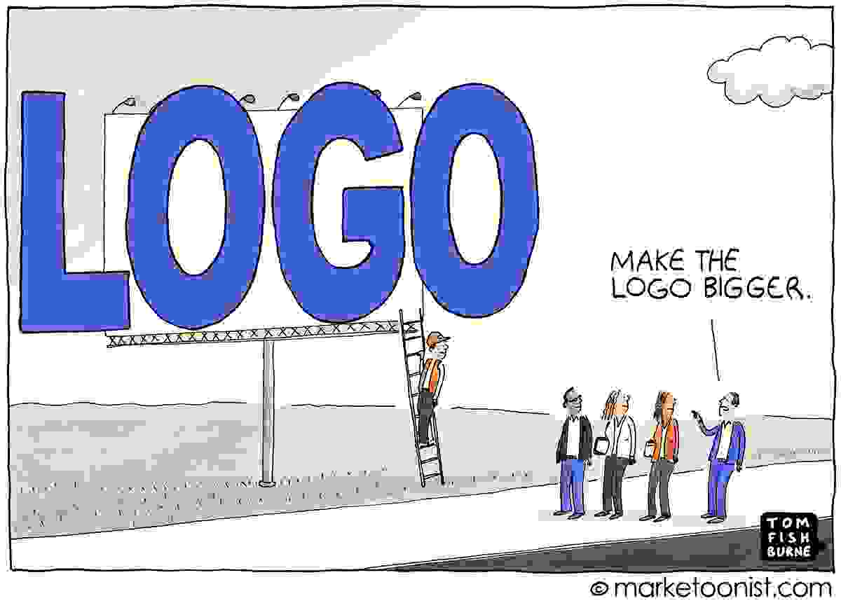
Can you make the logo bigger?
It’s a good thing if the client loves the logo or design you’ve created for them so much that they want it ‘bigger’, right? Not necessarily, bigger is not always better and there are ways we can illustrate this rationale to our clients.
When our client asks us this, as a first step, we should decipher in what instance the client wants the logo to be bigger. Is it on the website, business card, poster, presentation etc? If your client is referring to one of these, and making the logo bigger doesn’t affect the intention of the design, that’s a simple enough amendment. However, if it’s a more general statement rather than a particular instance, we can explain that the size of the logo will be dependent on the application it’s being applied to in order to help the client understand why various logo sizes are used.
In a practical sense, making the logo bigger can often be of detriment to user experience and overall design. For example, if you click on a website and the logo takes up most of the screen, it will overwhelm the page, knock the hierarchy off, and make for a bad user experience.
Yes, we want the logo to be clearly visible and prominent but having white space surrounding the logo will actually help it to stand out and give it more visual prominence.
It might be the case of reminding the client that their logo is simply an extension of the brand, rather than the whole brand itself. Simple communication can often iron out confusion or uncertainty and if it doesn’t reach the outcome alone, it will often get you a lot closer.
And finally
If this blog wasn’t already full of cliches, here’s another – each and every piece of feedback we receive is an opportunity to learn, improve, and create something even better than the original. Rather than feeling frustrated or disheartened at client feedback, whether it’s one we’ve listed here or another, we can use the feedback as a chance to create an even more effective and impactful design.
To summarise, here are some things that can help reach the outcome of a happy client:
- Ask the client to use more descriptive words in their feedback
- Try to find out which elements of the design the client is drawn to, and which they are unsure of
- Try not to use designer jargon
- Be transparent about the process and what the client can expect from the start
- Present designs and ideas in a way that makes sense and shows the rationale where necessary
- Remember, communication is key
It all comes down to trying to really understand what it is that our clients are trying to communicate and striving to reach a design solution that fits the problem and makes our client happy.