Mobile First Design And Why It's Important For Your Website
There was a point in life (which may seem a billion years ago now) when ‘web’ design simply meant designing for the big ol’ box computer.
Now, of course, the ‘web’ does not just refer to the computer but is accessible from a whole range of devices from our laptops to our tablets and our mobile phones. This means we are no longer designing for one device or one size but have to consider every possible screen that our websites will be viewed upon, especially mobile devices.
Once it became this way, it was time to consider that a newer approach may be necessary. And in 2010, Eric Schmidt (former CEO of Google) came forward to say that Google would be taking a mobile first design approach.
If Google were doing it, shouldn’t we all!? This was a major catalyst for many web designers, who shifted their thinking to a mobile first design approach, and started creating a mobile first responsive web design method for the future.
What is a mobile first design approach?
A mobile first web design approach means that you consider the smallest screen first (the mobile) when you are designing, working your way up towards the biggest screen (the desktop computer). The mobile design of websites becomes the priority, so that there is both a mobile version and a desktop version of responsive websites.
Why would you use a mobile first design approach?
We are now at a stage where great design cannot simply look great but equally must function great, which is achieved by combining carefully constructed content, UX planning, design and development.
This means that considering mobile devices when designing and developing a website layout is going to allow more users to feel comfortable using the website, and potentially purchasing from your website. Mobile first UX design and web development allow for a mobile first website to form, creating an incredible mobile friendly website that leaves potential consumers happy.
Think about if you are researching for something quickly on your mobile phone or through mobile apps. If you are viewing a mobile first responsive web design, you will feel like your experience on the mobile site is better, which leaves an overall positive impression.
If there were not a mobile first design being used, the experience might be more frustrating and negative, therefore allowing less trust in the business' website.
Mobile First Design Tips
Creating a mobile first responsive website sounds wonderful, we're sure, but it is not all sunshine and rainbows. A lot of mobile first design strategy takes into consideration different visual hierarchy and accessibility concerns, considering that the full website design needs to be displayed on a small mobile screen.
1. Mobile First Design Content = Mobile user friendly
When you begin a mobile first design, you need to remember that this is the most limited device there is (in terms of screen size and bandwidth, among many others). Therefore, you are forced to put functionality at the forefront by considering what is most essential to your design.
In order to think about your website in a mobile first design point of view, it is crucial to create mobile design that only features the most important part of your brand.
When the content is mobile friendly and therefore user-focused design, mobile users are getting what they need as soon as they need it, and enjoying the design elements along the way.
2. Progressive enhancement vs graceful degradation
By doing mobile first design approach, you are using a progressive enhancement technique, including different devices into the design of your website and considering all your users, desktop and mobile.
With progressive enhancement, you are ‘enhancing’ the site for the best user experience possible. You can then build upon this and add more features and content to make it even better as you go along.
This is opposed to graceful degradation, which means creating a full, standard desktop website and then scaling back and removing content and features for a smaller screen and for mobile users.
This can cause a lot of problems as it makes mobile design your last thought, so it can lack the necessary functionalities needed to serve mobile user experience.
3. Mobile Website Functionality and Responsive web design
We have established that when designing mobile first websites, the design and content needs to create a mobile friendly website. But, does this mean that mobile friendly websites lack additional content?
Mobile first design strategy needs to include actions that make smartphone users capable of having a responsive website experience. Mobile users should still be able to view important features and have the basic functions that desktop users have on the website.
An important aspect of mobile first design is understanding what draws users to do their searching on a mobile device?
One of the most speculated answers will be the act of scrolling. Scrolling through social media, content, and websites has becomes second nature to mobile users.
Design teams and developers should take into account how scrollable and responsive a mobile website is. This will allow the website to not only be functional and have the essential features of a website, but be attractive to mobile users as well.
JUMP’s mobile first design approach
At JUMP, we have tried and tested a lot of methods in the 15 years that we’ve been working across design and digital.
For us, a mobile first design approach might take more time and effort, but we believe it is what ensures our clients’ most important content is accessible to the world, across multiple devices.
Here are some examples of our mobile first designs in action, which start with the basic functionality and are built up by progressive enhancement.
NE1 - Get into Newcastle Mobile First Design
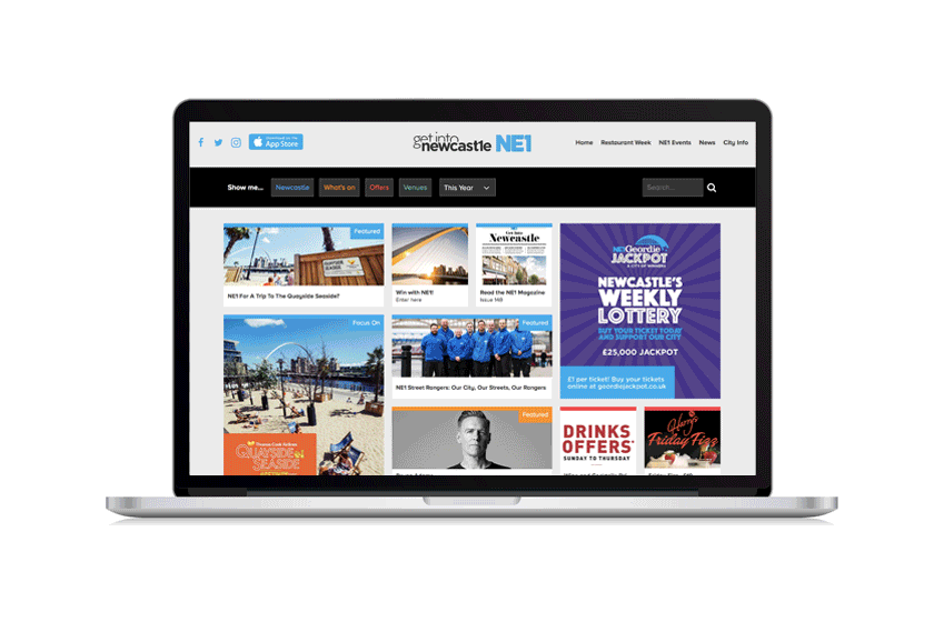
NE1 - Get into Newcastle
The NE1 Geordie Jackpot is the most popular feature of Get into Newcastle, so this had to take centre stage in addition to an obvious and easily-placed menu bar function. This increases responsiveness and functionality, while enhancing the most popular feature across the mobile design.
When we got to the desktop browser, we were able to add to this with various different features across the page from ‘featured’ to ‘offers’ to more.
View the full JUMP X NE1 case study here to see all that we did!
Shared Interest Mobile First Design
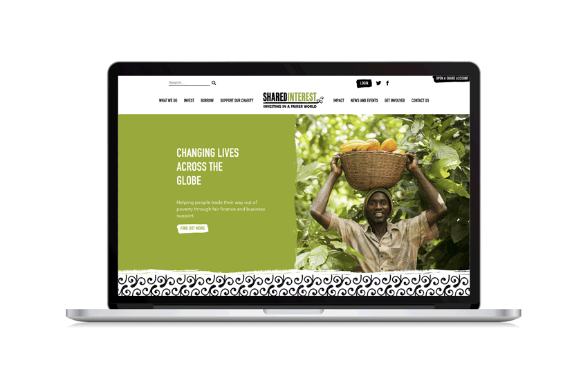
Shared Interest
Shared Interest wanted people to instantly recognise who they were and what they did, so website users could easily and quickly get the information they needed. This included a mobile first design with an emphasis on branding and functionality, using buttons and actions as a centre focus and priority within the design strategy.
The desktop version allowed us to build on this with more details including explanations, infographics, case studies and social media links. This additional information would not fit as nicely on the mobile version and smaller screens, so it was taken out of the mobile version, but still able to be easily found if wanted!
JUMP & Mobile First Design For You!
If you are interested in creating a mobile first approach to your website, and want your design to stand out, don't fret. JUMP is able to help you!
We have a clear standard design process, with graphic designers and a development team that puts you and your team's goals first - including an improved user experience.
If you are interested in seeing what JUMP can offer to your business, don't hesitate to reach out!