Flat user interface (UI) design
The majority of contemporary user interface design can be described as skeuomorphic; the ideology of replicating the physical world in the digital world. In other words, replicating the material qualities of something to make the design and structure feel more comfortable and familiar.
Skeuomorphism can be categorised into two areas; structure and style.
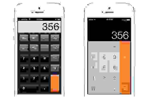
For example, if you look at a calculator app on your phone you will notice two things. Firstly, the structure of the calculator imitates that of a physical calculator, with the numbers in the same grid that you'd expect to see in real-life. Secondly, the design style has been considered to create an almost 3D look, making them look like physical buttons.
Both of which have been considered to make the design more intuitive.
Is this necessary?
We're all familiar with the cliche 'Less is more' and the notion that simplicity and clarity lead to good design. All those extra bells and whistles that you might like adding to your website don't actually add anything at all, and the core strength of the design will be diluted by these embellishments.
In the past few years, designers have embraced flat interface design and now the style is quickly becoming the preferred interface. Take for example, Apple's upcoming release of iOS 7. Currently, the proposals of the design shed the heavy drop shadows, textures and reflected surfaces, replacing them with a much simpler and flatter look with very little gloss or glitter.
Style over substance?
Generally, designing a glossy interface isn't always necessary unless the style reinforces the function of the application, like the design of a retro camera app for example. Adding glossy, leathery textures and drop shadows for the sake of adding them should be avoided as this generally makes the function more complicated than it needs to be.
What does matter is that the interface is structured in a way that assists your call-to-action. The information should be designed in the place that a user is expecting to find it, in a clear and east to read manor. Take the Amazon Kindle for example. Kindles do not rely on the material aesthetics in the same way that Apple iBooks do, essentially they're just black and white. The kindle does however, use design features which allow the user to relate to a traditional paper book; the position of page numbers, chapter names and layout of text, all of which allow the reader to become engrossed in the book.
To conclude
In the past, website and interface designs were often made to look technical with glossy 3D effects. Now that the internet and associated technology are very much a given, it seems that the technical aesthetic feels a little dated.
Print design followed a similar route, also influence by technology. Today print design is much simpler than it was in the 80s and 90s, when new technology opened it up to a range of, often over-the-top, and graphic effects. The abiding print aesthetic today is going full circle and readapting the old Swiss style of clean and flat graphics.
The use of shadows underneath buttons and leathery textures to a background are very much a thing of the past. A clean interface aids for better navigation and facilitates users' journey through a site.
The future holds a lot more for flat interface design so watch this space as technology goes two dimensional.