People's Theatre: the phoenix rises
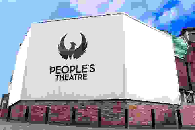
The People's Theatre phoenix logo
In classical mythology, a phoenix is 'a unique bird that lived for five or six centuries in the Arabian desert, after this time burning itself on a funeral pyre and rising from the ashes with renewed youth to live through another cycle.'
The People’s Theatre is the leading amateur theatre company in the North of England and has been entertaining audiences for over 100 years. They are funded completely by members, volunteers and ticket revenue, putting on 14 productions every year in their 500-seat auditorium. They give people from all walks of life the experience to participate in all aspects of theatre.
When the People’s Theatre commissioned JUMP to redesign their identity in 2015 as part of a big rebrand and renovation, we were immediately fascinated by the history of the theatre and how it lives so profoundly within their logo…
With the theatre being founded in 1911, the traditional phoenix emblem was born after the theatre's third move in 1929 when they moved from the city centre to Rye Hill. It was an appropriate symbol of rebirth and resurrection, aptly signifying the many times the theatre has had to start again and come back stronger than ever.
In 1960, it was decided that this original design would need modernising as part of a fundraising campaign for a new home and local designer Peter Reed donated this to the organisation.
When the then recently emptied Rye theatre burnt down, the phoenix quite literally rose from the ashes as James Gorbitt – a People’s Theatre actor – salvaged some remaining boards to create a replica of the logo for the new place.
Sixty-five years later, it became time for JUMP to redesign the logo, which was a great honour on our part. We were very aware that the iconic phoenix had presided over the door since the 1920s, representing the People’s Theatre and all that it stands for. We decided that in the same way a phoenix is regenerated, we simply wanted to breathe new life into the logo, making it bold and modern enough to rise up against national theatres without losing sight of its unique heritage.
It was a very proud moment when the logo and poster designs came to life, which has been a great success for both the People’s Theatre and JUMP. This month however, was a particularly humbling moment for all involved as they near the completion of their renovation.
It is now that we finally get to see the phoenix with its renewed youth and lease of life preside over the doors of the People’s Theatre again and live through yet another cycle.